FitPulse
Fitness tracking app designed to help users track workouts, monitor performance and build consistent training habits.
CLIENT
Self-Initiated
SERVICE
Design & Development
Industry
Fitness & Wellness
Download app
In review

Project Goal
FitPulse was created as a personal product concept focused on making workout tracking simple, structured and motivating.
The goal was to design a fitness experience that allows users to plan workouts, log exercises, track sets and weights, and visualize their progress over time without unnecessary complexity.
The project combines product strategy, UX/UI design, visual identity and app development into a single cohesive experience.

Result
The result is a complete fitness product ecosystem consisting of a native mobile application and a responsive marketing website.
The app provides workout planning, exercise logging, progress tracking, rest timers and performance insights, while the landing page introduces the product and guides users toward downloading the app.
The project demonstrates the complete process from product concept and UX architecture to visual design, interface development and responsive web implementation.
[Step 01] Product Concept & Strategy
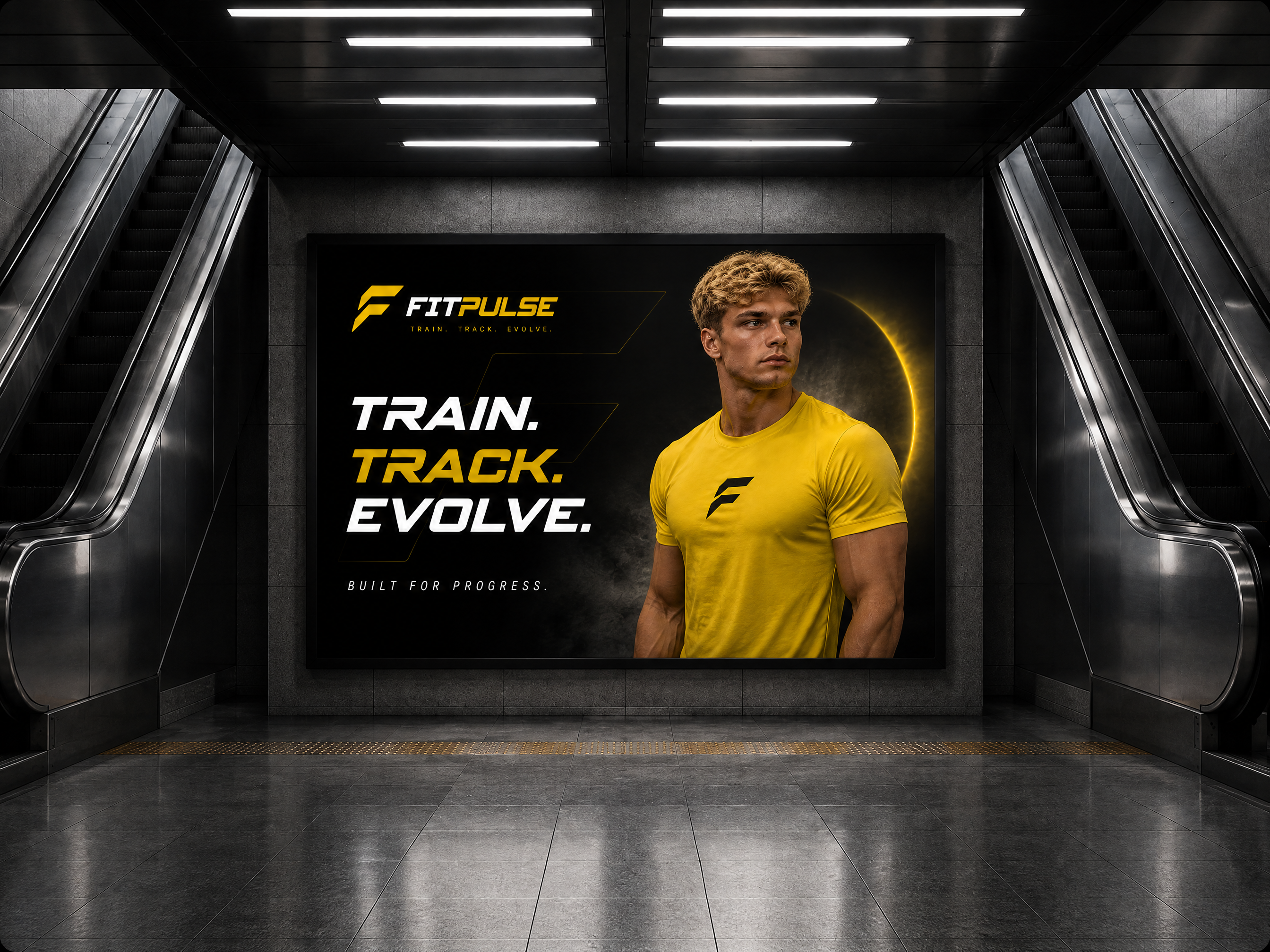
FitPulse started as a self-initiated product concept built around a simple idea: make workout tracking easier, clearer and more consistent.
The goal was to create a fitness app that helps users plan their workouts, record exercises, sets and weights, and understand their progress over time without adding unnecessary complexity.
The product was designed around real training habits, focusing on the moments that matter most — preparing for a workout, tracking performance during a session and reviewing progress afterwards.
[Step 02] UX Architecture & User Experience
With the product direction defined, the next step was to structure the experience around the main tasks users perform before, during and after a workout.
The interface was organized around four core areas: Home, Workout, Progress and Profile.
The goal was to keep workout tracking fast and intuitive while making performance data easy to understand. Each section was designed around a specific user need, creating a simple flow from planning a workout to recording performance and reviewing results.
[Step 03]Visual Identity & UI Design
The visual identity was developed around the concept of Calm Intelligence—a clean, minimal design language that communicates trust, clarity, and precision.
A restrained color palette, generous spacing, and carefully balanced typography create an interface that remains readable even when displaying large volumes of business data.
Every visual element was designed to support usability first while reinforcing a premium product experience.
[A] / [B] Color & Typography
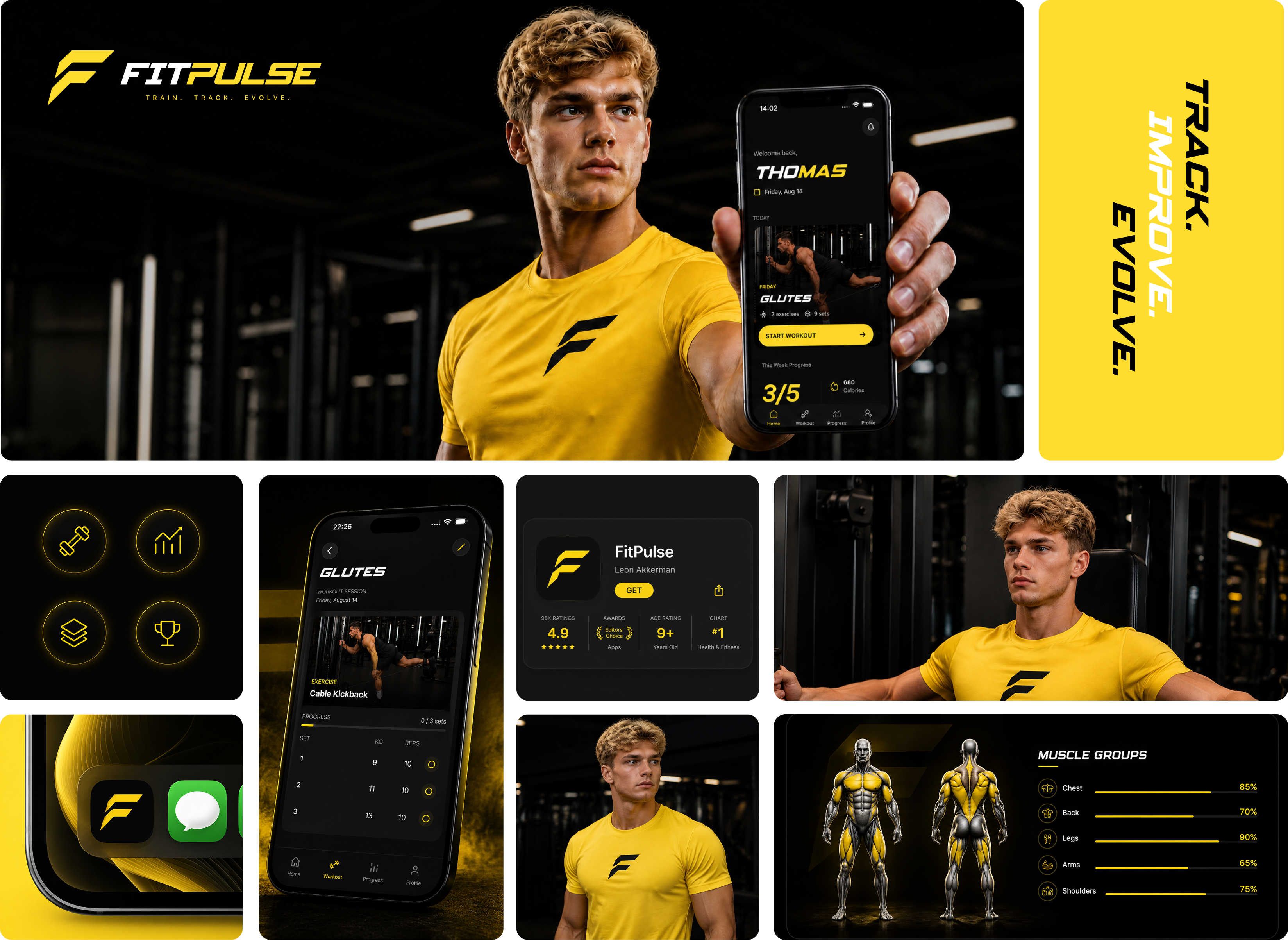
The visual identity of FitPulse is built around a high-contrast black and yellow palette, creating a bold and energetic aesthetic inspired by movement, performance, and modern fitness culture.
The primary yellow acts as the main accent, highlighting key actions, progress indicators, icons, and important interface elements. Deep black backgrounds provide contrast and keep the interface focused, while white is used for clarity and hierarchy.
Spy Agency Italic was selected as the display typeface for headlines and key statements. Its sharp, dynamic character reinforces the athletic and performance-driven personality of FitPulse, giving the brand a distinctive visual voice.
SF Pro Display serves as the primary interface typeface, providing clean readability across navigation, descriptions, metrics, and functional elements. The combination of both typefaces creates a balance between expressive branding and a clear, highly usable interface.
[Step 04]Mobile App Design
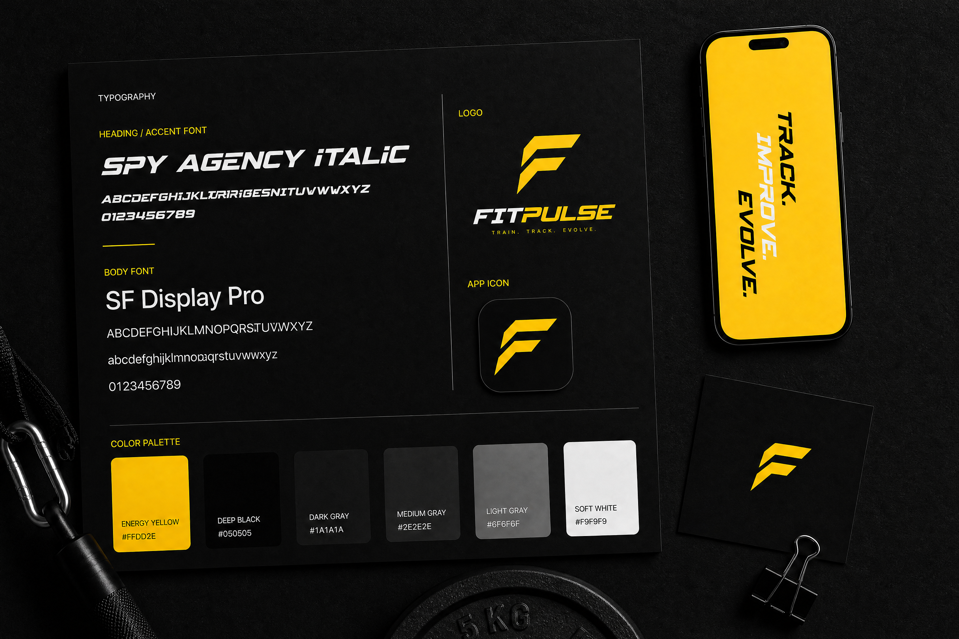
The interface was then developed into a complete mobile experience focused on everyday gym use.
The main workout flow allows users to select a workout, view exercises, log sets and weights, and move through their session without unnecessary interactions.
Additional screens were designed to help users review their training history, monitor progress and understand how their performance changes over time.
[Step 05]From Workout to Progress
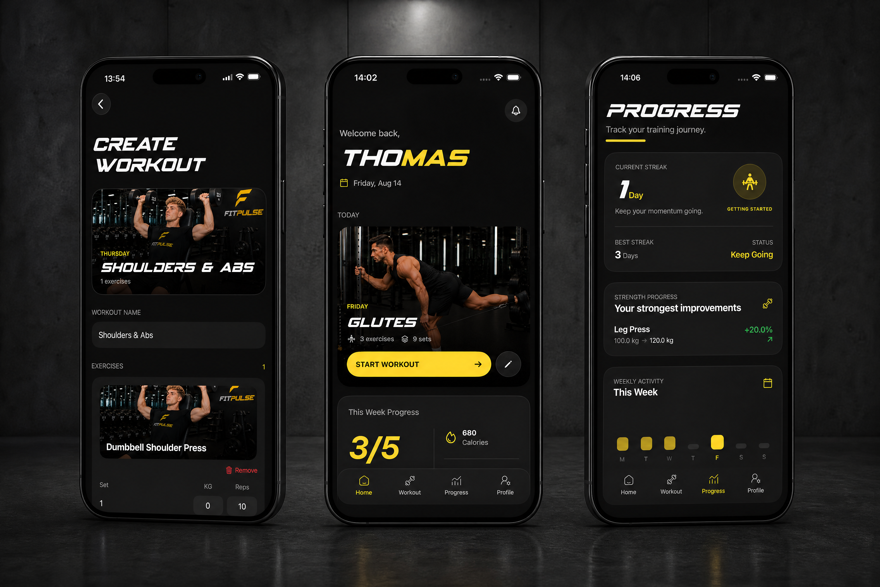
One of the main principles behind FitPulse was turning individual workouts into visible long-term progress.
Instead of treating each training session as an isolated activity, the product connects exercises, sets, weights and workout history to help users understand how they are improving over time.
Progress is presented through clear visual feedback, allowing users to track personal bests, training volume and performance changes without overwhelming them with unnecessary data.
[Step 06]Landing Page & Product Communication
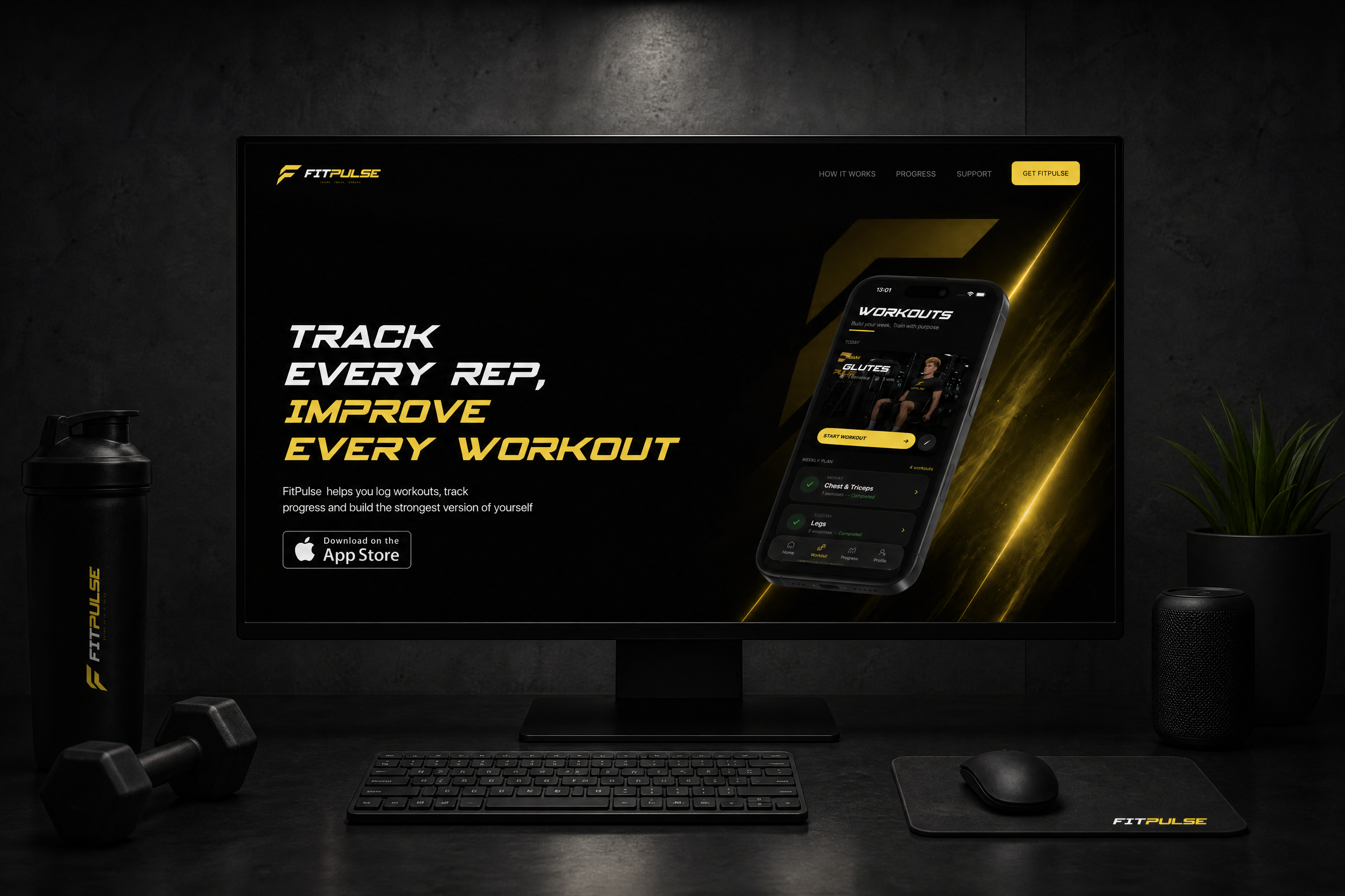
Once the product experience was defined, I created a dedicated landing page to introduce FitPulse and communicate its value outside the app.
The landing page follows the same visual language as the mobile product, using the black and yellow color system, typography and interface elements to create a consistent brand experience.
The page was structured around a simple narrative: introduce the product, explain how it works, demonstrate the benefits, show progress and guide users toward downloading the app.
[Step 07]Responsive Web Experience
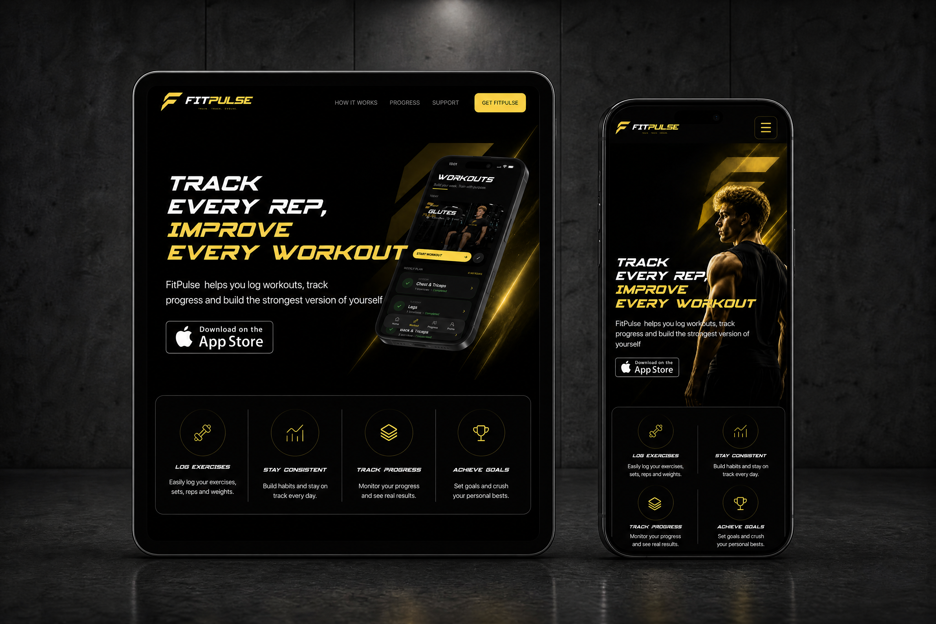
The landing page was designed to work across desktop, tablet and mobile devices.
Instead of simply scaling the desktop layout, the composition was adapted for each screen size. Content hierarchy, typography, imagery, navigation and spacing were adjusted to maintain the same visual impact and usability across devices.
FitPulse
Fitness tracking app designed to help users track workouts, monitor performance and build consistent training habits.
CLIENT
Self-Initiated
SERVICE
Design & Development
Industry
Fitness & Wellness
Download app
In review
Project Goal
FitPulse was created as a personal product concept focused on making workout tracking simple, structured and motivating.
The goal was to design a fitness experience that allows users to plan workouts, log exercises, track sets and weights, and visualize their progress over time without unnecessary complexity.
The project combines product strategy, UX/UI design, visual identity and app development into a single cohesive experience.
Result
The result is a complete fitness product ecosystem consisting of a native mobile application and a responsive marketing website.
The app provides workout planning, exercise logging, progress tracking, rest timers and performance insights, while the landing page introduces the product and guides users toward downloading the app.
The project demonstrates the complete process from product concept and UX architecture to visual design, interface development and responsive web implementation.
[Step 01] Product Concept & Strategy
FitPulse started as a self-initiated product concept built around a simple idea: make workout tracking easier, clearer and more consistent.
The goal was to create a fitness app that helps users plan their workouts, record exercises, sets and weights, and understand their progress over time without adding unnecessary complexity.
The product was designed around real training habits, focusing on the moments that matter most — preparing for a workout, tracking performance during a session and reviewing progress afterwards.
[Step 02] UX Architecture & User Experience
With the product direction defined, the next step was to structure the experience around the main tasks users perform before, during and after a workout.
The interface was organized around four core areas: Home, Workout, Progress and Profile.
The goal was to keep workout tracking fast and intuitive while making performance data easy to understand. Each section was designed around a specific user need, creating a simple flow from planning a workout to recording performance and reviewing results.
[Step 03]Visual Identity & UI Design
The visual identity was developed around the concept of Calm Intelligence—a clean, minimal design language that communicates trust, clarity, and precision.
A restrained color palette, generous spacing, and carefully balanced typography create an interface that remains readable even when displaying large volumes of business data.
Every visual element was designed to support usability first while reinforcing a premium product experience.
[A] / [B] Color & Typography
The visual identity of FitPulse is built around a high-contrast black and yellow palette, creating a bold and energetic aesthetic inspired by movement, performance, and modern fitness culture.
The primary yellow acts as the main accent, highlighting key actions, progress indicators, icons, and important interface elements. Deep black backgrounds provide contrast and keep the interface focused, while white is used for clarity and hierarchy.
Spy Agency Italic was selected as the display typeface for headlines and key statements. Its sharp, dynamic character reinforces the athletic and performance-driven personality of FitPulse, giving the brand a distinctive visual voice.
SF Pro Display serves as the primary interface typeface, providing clean readability across navigation, descriptions, metrics, and functional elements. The combination of both typefaces creates a balance between expressive branding and a clear, highly usable interface.
[Step 04]Mobile App Design
The interface was then developed into a complete mobile experience focused on everyday gym use.
The main workout flow allows users to select a workout, view exercises, log sets and weights, and move through their session without unnecessary interactions.
Additional screens were designed to help users review their training history, monitor progress and understand how their performance changes over time.
[Step 05]From Workout to Progress
One of the main principles behind FitPulse was turning individual workouts into visible long-term progress.
Instead of treating each training session as an isolated activity, the product connects exercises, sets, weights and workout history to help users understand how they are improving over time.
Progress is presented through clear visual feedback, allowing users to track personal bests, training volume and performance changes without overwhelming them with unnecessary data.
[Step 06]Landing Page & Product Communication
Once the product experience was defined, I created a dedicated landing page to introduce FitPulse and communicate its value outside the app.
The landing page follows the same visual language as the mobile product, using the black and yellow color system, typography and interface elements to create a consistent brand experience.
The page was structured around a simple narrative: introduce the product, explain how it works, demonstrate the benefits, show progress and guide users toward downloading the app.
[Step 07]Responsive Web Experience
The landing page was designed to work across desktop, tablet and mobile devices.
Instead of simply scaling the desktop layout, the composition was adapted for each screen size. Content hierarchy, typography, imagery, navigation and spacing were adjusted to maintain the same visual impact and usability across devices.

leon akkerman
FitPulse
Fitness tracking app designed to help users track workouts, monitor performance and build consistent training habits.
CLIENT
Self-Initiated
SERVICE
Design & Development
Industry
Fitness & Wellness
Download app
In review
Project Goal
FitPulse was created as a personal product concept focused on making workout tracking simple, structured and motivating.
The goal was to design a fitness experience that allows users to plan workouts, log exercises, track sets and weights, and visualize their progress over time without unnecessary complexity.
The project combines product strategy, UX/UI design, visual identity and app development into a single cohesive experience.
Result
The result is a complete fitness product ecosystem consisting of a native mobile application and a responsive marketing website.
The app provides workout planning, exercise logging, progress tracking, rest timers and performance insights, while the landing page introduces the product and guides users toward downloading the app.
The project demonstrates the complete process from product concept and UX architecture to visual design, interface development and responsive web implementation.
[Step 01] Product Concept & Strategy
FitPulse started as a self-initiated product concept built around a simple idea: make workout tracking easier, clearer and more consistent.
The goal was to create a fitness app that helps users plan their workouts, record exercises, sets and weights, and understand their progress over time without adding unnecessary complexity.
The product was designed around real training habits, focusing on the moments that matter most — preparing for a workout, tracking performance during a session and reviewing progress afterwards.
[Step 02] UX Architecture & User Experience
With the product direction defined, the next step was to structure the experience around the main tasks users perform before, during and after a workout.
The interface was organized around four core areas: Home, Workout, Progress and Profile.
The goal was to keep workout tracking fast and intuitive while making performance data easy to understand. Each section was designed around a specific user need, creating a simple flow from planning a workout to recording performance and reviewing results.
[Step 03]Visual Identity & UI Design
The visual identity was developed around the concept of Calm Intelligence—a clean, minimal design language that communicates trust, clarity, and precision.
A restrained color palette, generous spacing, and carefully balanced typography create an interface that remains readable even when displaying large volumes of business data.
Every visual element was designed to support usability first while reinforcing a premium product experience.
[A] / [B] Color & Typography
The visual identity of FitPulse is built around a high-contrast black and yellow palette, creating a bold and energetic aesthetic inspired by movement, performance, and modern fitness culture.
The primary yellow acts as the main accent, highlighting key actions, progress indicators, icons, and important interface elements. Deep black backgrounds provide contrast and keep the interface focused, while white is used for clarity and hierarchy.
Spy Agency Italic was selected as the display typeface for headlines and key statements. Its sharp, dynamic character reinforces the athletic and performance-driven personality of FitPulse, giving the brand a distinctive visual voice.
SF Pro Display serves as the primary interface typeface, providing clean readability across navigation, descriptions, metrics, and functional elements. The combination of both typefaces creates a balance between expressive branding and a clear, highly usable interface.
[Step 04]Mobile App Design
The interface was then developed into a complete mobile experience focused on everyday gym use.
The main workout flow allows users to select a workout, view exercises, log sets and weights, and move through their session without unnecessary interactions.
Additional screens were designed to help users review their training history, monitor progress and understand how their performance changes over time.
[Step 05]From Workout to Progress
One of the main principles behind FitPulse was turning individual workouts into visible long-term progress.
Instead of treating each training session as an isolated activity, the product connects exercises, sets, weights and workout history to help users understand how they are improving over time.
Progress is presented through clear visual feedback, allowing users to track personal bests, training volume and performance changes without overwhelming them with unnecessary data.
[Step 06]Landing Page & Product Communication
Once the product experience was defined, I created a dedicated landing page to introduce FitPulse and communicate its value outside the app.
The landing page follows the same visual language as the mobile product, using the black and yellow color system, typography and interface elements to create a consistent brand experience.
The page was structured around a simple narrative: introduce the product, explain how it works, demonstrate the benefits, show progress and guide users toward downloading the app.
[Step 07]Responsive Web Experience
The landing page was designed to work across desktop, tablet and mobile devices.
Instead of simply scaling the desktop layout, the composition was adapted for each screen size. Content hierarchy, typography, imagery, navigation and spacing were adjusted to maintain the same visual impact and usability across devices.
leon akkerman