LaRusa Tax
Local Clearwater accounting firm that specializes in income taxes, payroll, and bookkeeping.

Project goal
The primary challenge was to design a platform that goes beyond a traditional marketing website and functions as a structured learning system. The experience had to serve two very different user groups: beginners with no financial background and professionals seeking advanced certification. This required a clear information hierarchy, simplified navigation, and thoughtful content organization to prevent cognitive overload.
At the same time, the project demanded the development of a personal account area where users could access purchased courses, track progress, revisit recordings, and manage their payments. The interface needed to remain intuitive while supporting complex educational functionality such as module structures, lesson tracking, downloadable materials, and live-event access. Balancing clarity, professionalism, and technical depth was essential to building trust within a competitive educational market.

Result
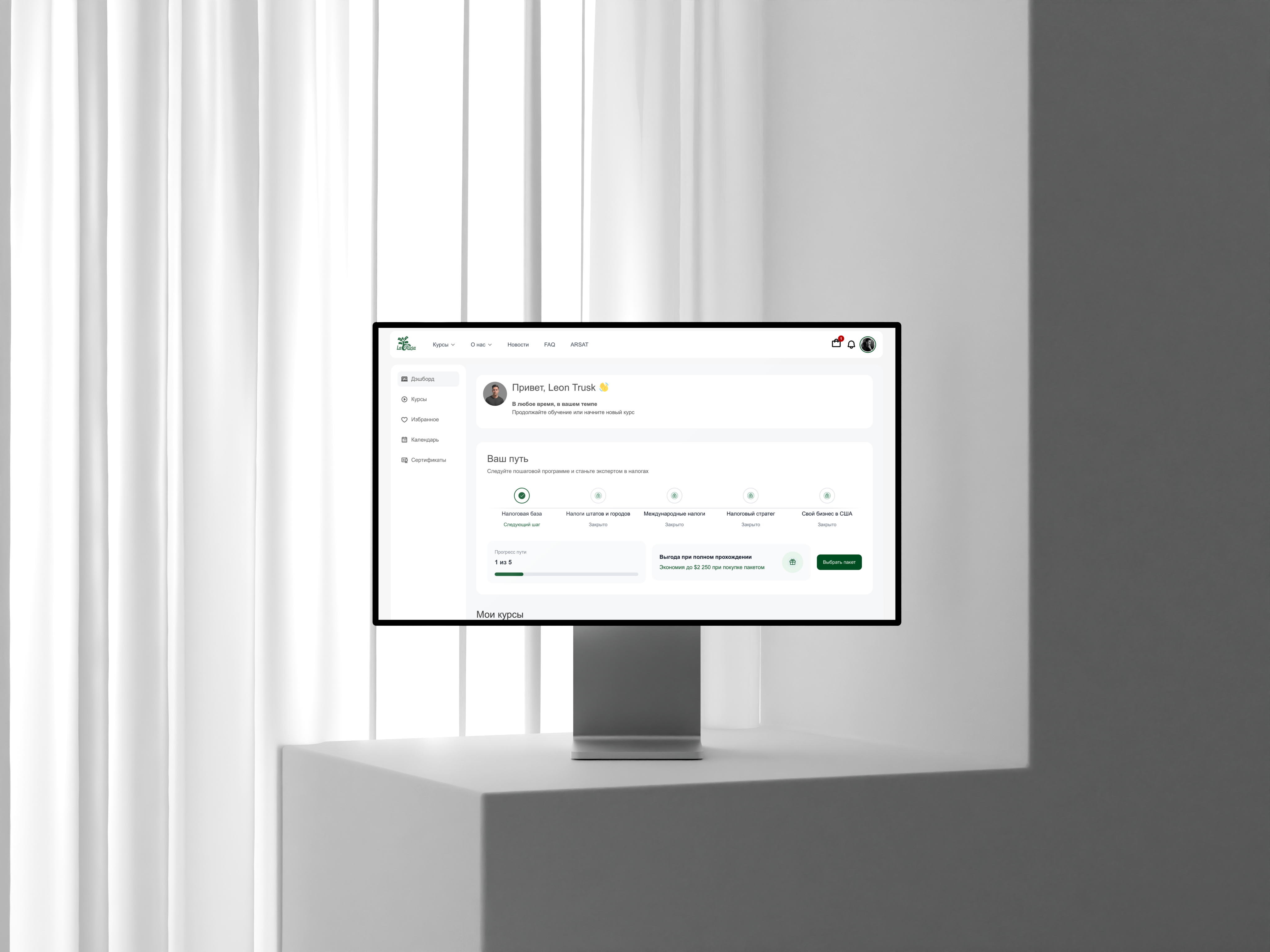
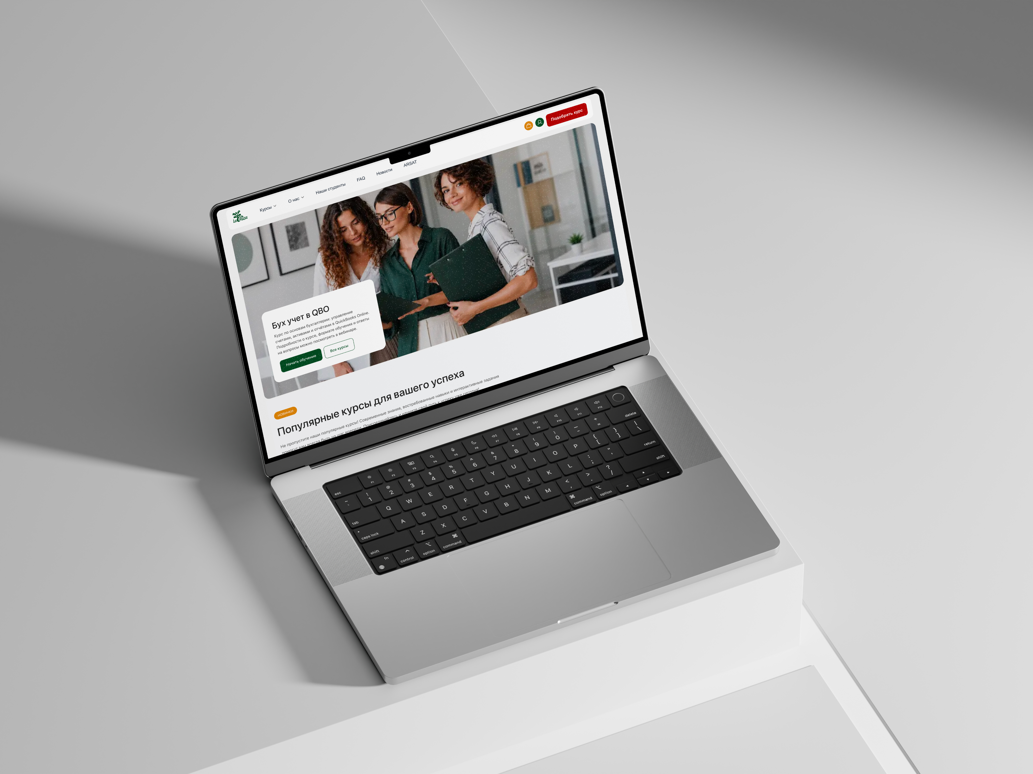
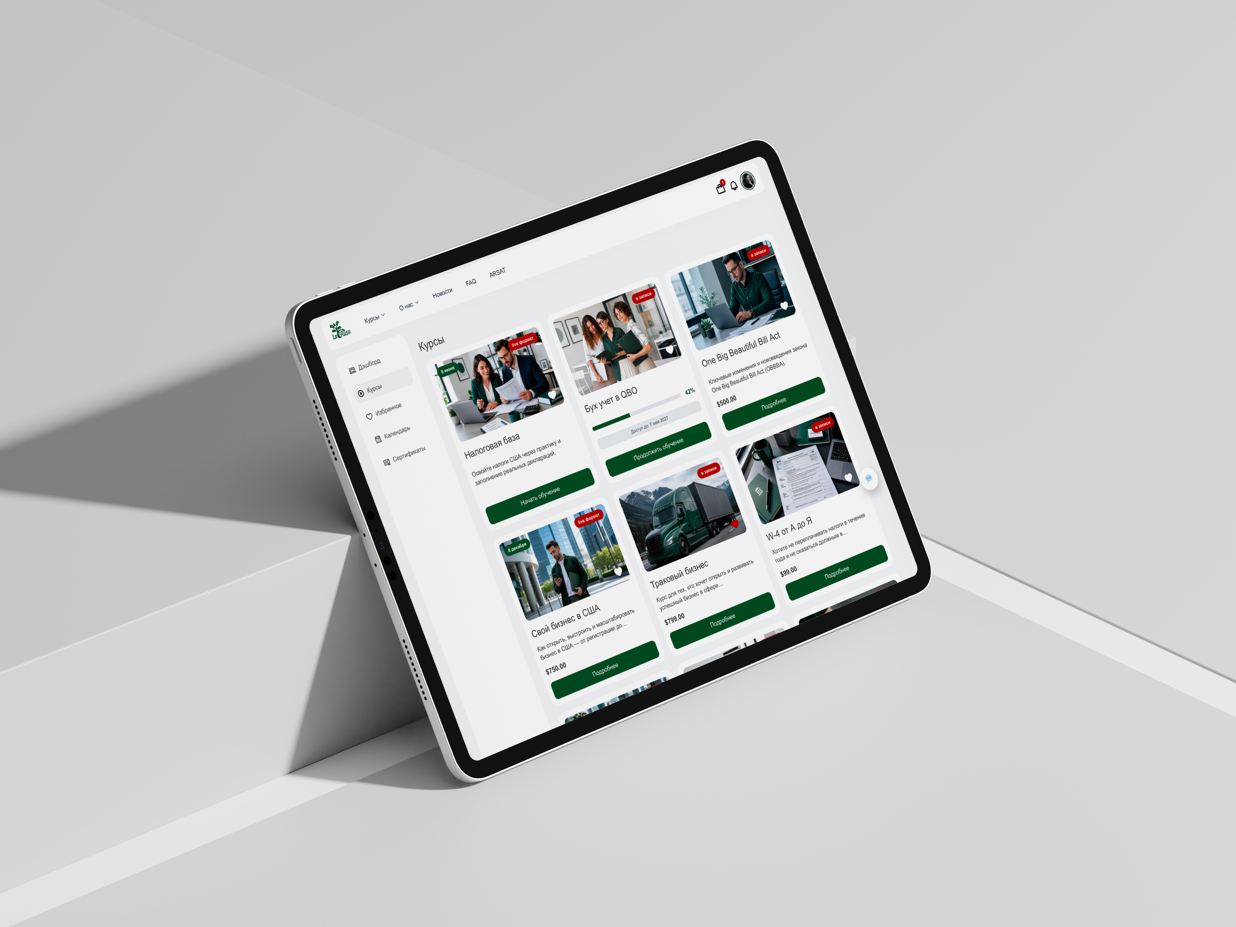
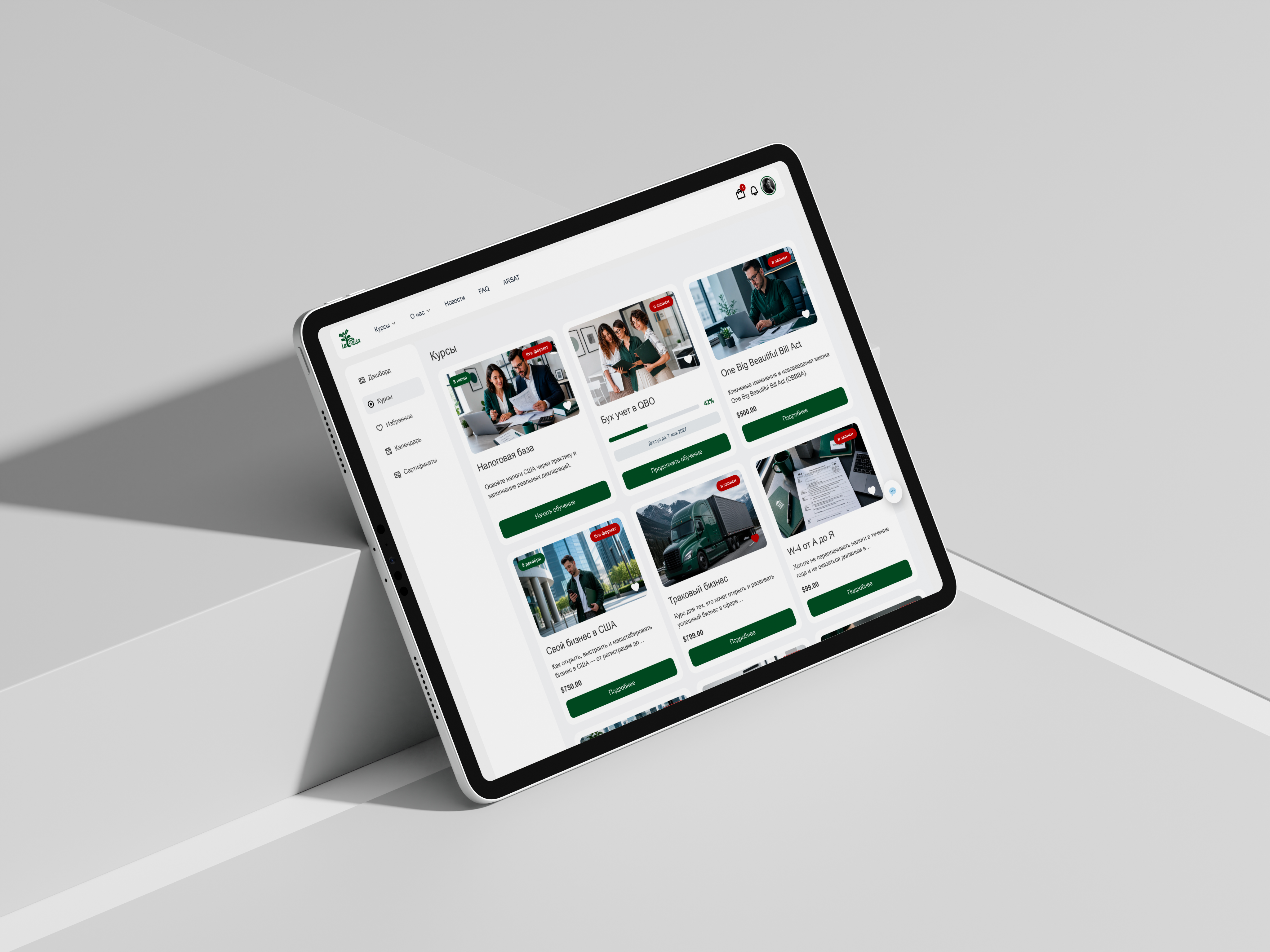
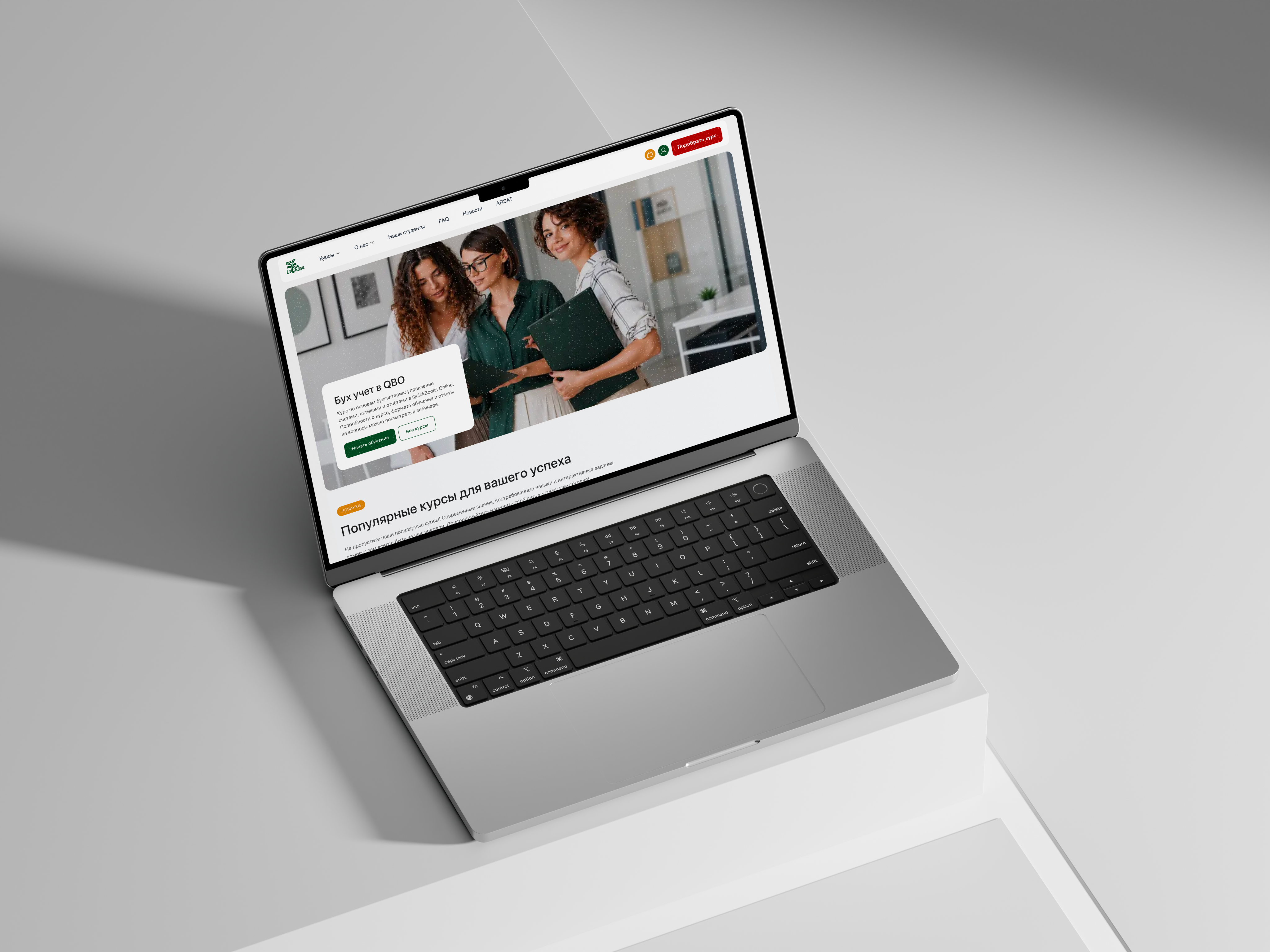
The final outcome is a cohesive educational platform that integrates marketing, enrollment, and structured learning into one seamless system. The website effectively communicates credibility and expertise while guiding users naturally toward course selection and purchase. Once enrolled, students transition into a well-organized personal dashboard where all learning materials are clearly structured and easy to navigate.
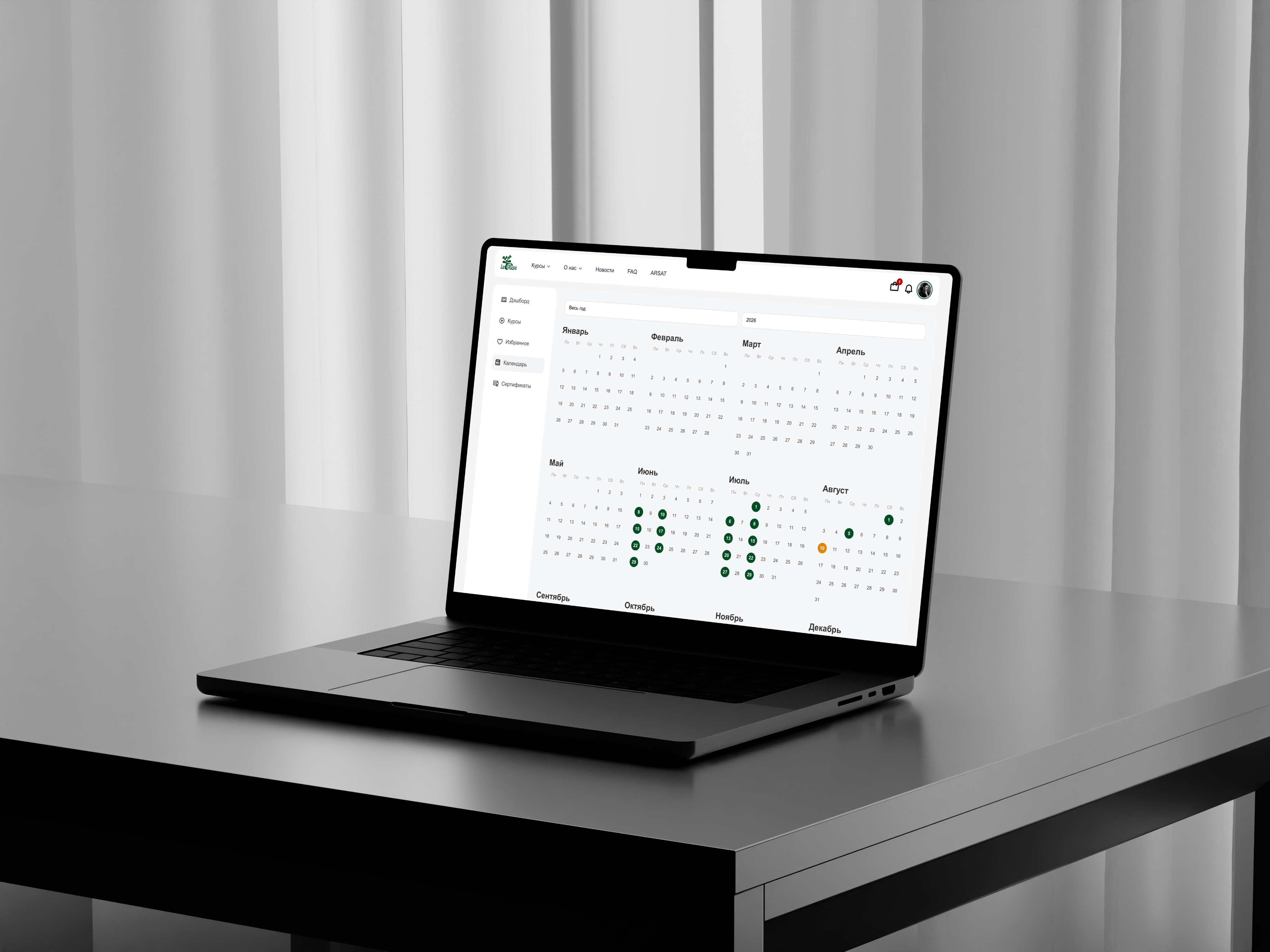
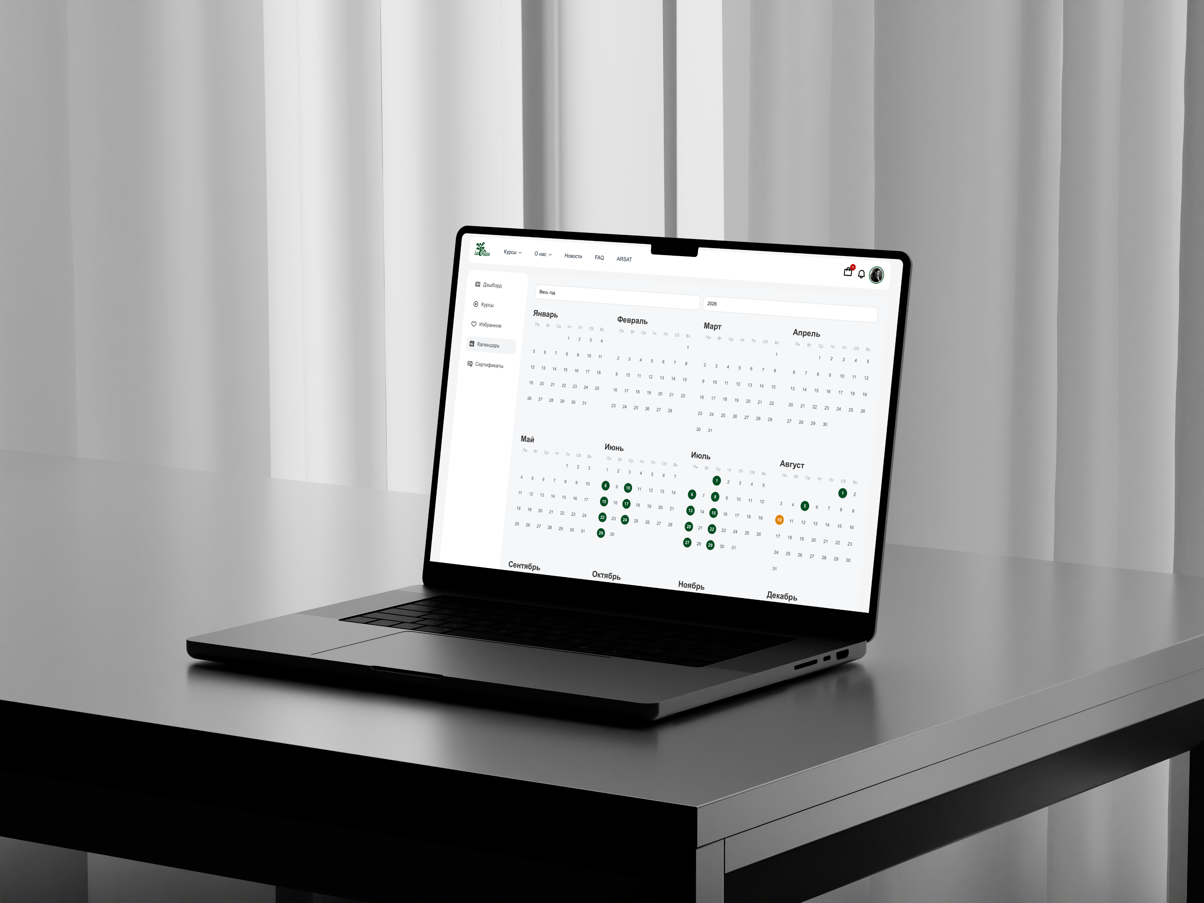
The student account area supports progress tracking, lesson completion states, access to live session recordings, and downloadable resources without overwhelming the user. The design system ensures visual consistency across the public-facing site and the internal learning environment, creating a unified brand experience. The platform now functions not only as a sales tool, but as a scalable digital infrastructure for long-term educational growth.
[Step 01] Website Strategy & Content Structure
The project began with defining the overall structure of the platform and mapping the user journey from first interaction to course completion. At this stage, the focus was not on visual design but on logic, flow, and clarity. It was essential to understand how information should unfold as users scroll, how trust is built through content, and how complexity can be simplified without losing depth.
Special attention was given to aligning marketing goals with educational structure. The platform needed to communicate authority while remaining accessible to beginners. By defining content priorities, section hierarchy, and conversion paths early on, a solid foundation was established for all future design decisions. This strategic groundwork ensured that both the public website and the internal learning system would function cohesively.
[Step 02] Wireframing & Layout Planning
With the content structure defined, the next phase focused on translating strategy into layout. Wireframes were developed to test proportions, spacing, and rhythm across the platform. This allowed exploration of how sections interact visually and how users transition between marketing content and learning interfaces.
The wireframing stage was particularly important due to the dual nature of the project: a sales-driven website and a functional student dashboard. Layout decisions had to support clarity and hierarchy while anticipating the density of educational materials. By removing visual distractions and working strictly in structural blocks, the focus remained on usability, balance, and intuitive navigation before introducing visual identity elements.
[A] / [B] Color & Typography
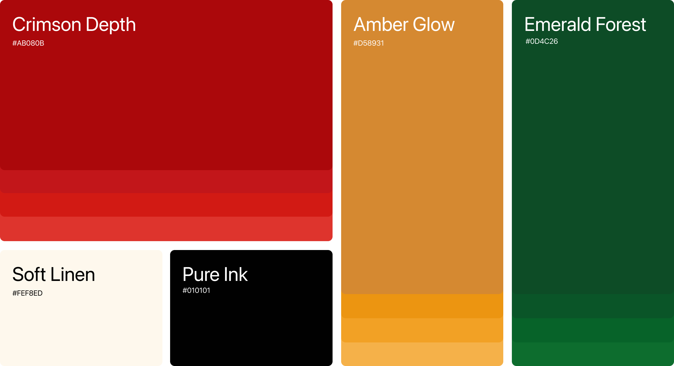
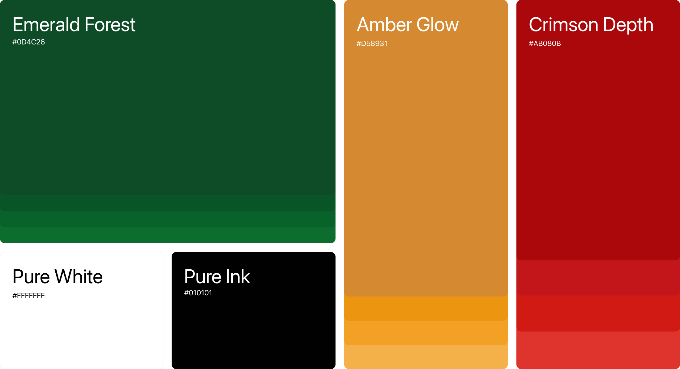
The color palette was crafted to reflect trust, clarity, and professional growth.Deep green tones communicate stability and financial confidence, while warm amber accents highlight progress, attention, and key interactions throughout the platform.
Strong red tones were introduced to create visual contrast for important actions and notifications, helping users navigate educational content with clarity and focus.
Combined with clean typography and spacious layouts, the system creates a modern learning experience that feels structured, approachable, and reliable.
Understanding Taxes, Simplified
Arial Regular
Local Clearwater accounting firm that specializes in income taxes, payroll, and bookkeeping.Body CopyArial Regular
Structured Tax Education for ProfessionalsHeadlineArial Regular
Let's make your Brand shine
LaRusa Tax
Local Clearwater accounting firm that specializes in income taxes, payroll, and bookkeeping.

Project goal
The primary challenge was to design a platform that goes beyond a traditional marketing website and functions as a structured learning system. The experience had to serve two very different user groups: beginners with no financial background and professionals seeking advanced certification. This required a clear information hierarchy, simplified navigation, and thoughtful content organization to prevent cognitive overload.
At the same time, the project demanded the development of a personal account area where users could access purchased courses, track progress, revisit recordings, and manage their payments. The interface needed to remain intuitive while supporting complex educational functionality such as module structures, lesson tracking, downloadable materials, and live-event access. Balancing clarity, professionalism, and technical depth was essential to building trust within a competitive educational market.

Result
The final outcome is a cohesive educational platform that integrates marketing, enrollment, and structured learning into one seamless system. The website effectively communicates credibility and expertise while guiding users naturally toward course selection and purchase. Once enrolled, students transition into a well-organized personal dashboard where all learning materials are clearly structured and easy to navigate.
The student account area supports progress tracking, lesson completion states, access to live session recordings, and downloadable resources without overwhelming the user. The design system ensures visual consistency across the public-facing site and the internal learning environment, creating a unified brand experience. The platform now functions not only as a sales tool, but as a scalable digital infrastructure for long-term educational growth.
[Step 01] Website Strategy & Content Structure
The project began with defining the overall structure of the platform and mapping the user journey from first interaction to course completion. At this stage, the focus was not on visual design but on logic, flow, and clarity. It was essential to understand how information should unfold as users scroll, how trust is built through content, and how complexity can be simplified without losing depth.
Special attention was given to aligning marketing goals with educational structure. The platform needed to communicate authority while remaining accessible to beginners. By defining content priorities, section hierarchy, and conversion paths early on, a solid foundation was established for all future design decisions. This strategic groundwork ensured that both the public website and the internal learning system would function cohesively.
[Step 02] Wireframing & Layout Planning
With the content structure defined, the next phase focused on translating strategy into layout. Wireframes were developed to test proportions, spacing, and rhythm across the platform. This allowed exploration of how sections interact visually and how users transition between marketing content and learning interfaces.
The wireframing stage was particularly important due to the dual nature of the project: a sales-driven website and a functional student dashboard. Layout decisions had to support clarity and hierarchy while anticipating the density of educational materials. By removing visual distractions and working strictly in structural blocks, the focus remained on usability, balance, and intuitive navigation before introducing visual identity elements.






[A] / [B] Color & Typography
The color palette was crafted to reflect trust, clarity, and professional growth.Deep green tones communicate stability and financial confidence, while warm amber accents highlight progress, attention, and key interactions throughout the platform.
Strong red tones were introduced to create visual contrast for important actions and notifications, helping users navigate educational content with clarity and focus.
Combined with clean typography and spacious layouts, the system creates a modern learning experience that feels structured, approachable, and reliable.
Understanding Taxes, Simplified
Arial Regular
Local Clearwater accounting firm that specializes in income taxes, payroll, and bookkeeping.Body CopyArial Regular
Structured Tax Education for ProfessionalsHeadlineArial Regular
Let's make your Brand shine

leon akkerman
LaRusa Tax
Local Clearwater accounting firm that specializes in income taxes, payroll, and bookkeeping.

Project goal
The primary challenge was to design a platform that goes beyond a traditional marketing website and functions as a structured learning system. The experience had to serve two very different user groups: beginners with no financial background and professionals seeking advanced certification. This required a clear information hierarchy, simplified navigation, and thoughtful content organization to prevent cognitive overload.
At the same time, the project demanded the development of a personal account area where users could access purchased courses, track progress, revisit recordings, and manage their payments. The interface needed to remain intuitive while supporting complex educational functionality such as module structures, lesson tracking, downloadable materials, and live-event access. Balancing clarity, professionalism, and technical depth was essential to building trust within a competitive educational market.

Result
The final outcome is a cohesive educational platform that integrates marketing, enrollment, and structured learning into one seamless system. The website effectively communicates credibility and expertise while guiding users naturally toward course selection and purchase. Once enrolled, students transition into a well-organized personal dashboard where all learning materials are clearly structured and easy to navigate.
The student account area supports progress tracking, lesson completion states, access to live session recordings, and downloadable resources without overwhelming the user. The design system ensures visual consistency across the public-facing site and the internal learning environment, creating a unified brand experience. The platform now functions not only as a sales tool, but as a scalable digital infrastructure for long-term educational growth.
[Step 01] Website Strategy & Content Structure
The project began with defining the overall structure of the platform and mapping the user journey from first interaction to course completion. At this stage, the focus was not on visual design but on logic, flow, and clarity. It was essential to understand how information should unfold as users scroll, how trust is built through content, and how complexity can be simplified without losing depth.
Special attention was given to aligning marketing goals with educational structure. The platform needed to communicate authority while remaining accessible to beginners. By defining content priorities, section hierarchy, and conversion paths early on, a solid foundation was established for all future design decisions. This strategic groundwork ensured that both the public website and the internal learning system would function cohesively.
[Step 02] Wireframing & Layout Planning
With the content structure defined, the next phase focused on translating strategy into layout. Wireframes were developed to test proportions, spacing, and rhythm across the platform. This allowed exploration of how sections interact visually and how users transition between marketing content and learning interfaces.
The wireframing stage was particularly important due to the dual nature of the project: a sales-driven website and a functional student dashboard. Layout decisions had to support clarity and hierarchy while anticipating the density of educational materials. By removing visual distractions and working strictly in structural blocks, the focus remained on usability, balance, and intuitive navigation before introducing visual identity elements.

[A] / [B] Color & Typography
The color palette was crafted to reflect trust, clarity, and professional growth.Deep green tones communicate stability and financial confidence, while warm amber accents highlight progress, attention, and key interactions throughout the platform.
Strong red tones were introduced to create visual contrast for important actions and notifications, helping users navigate educational content with clarity and focus.
Combined with clean typography and spacious layouts, the system creates a modern learning experience that feels structured, approachable, and reliable.
Understanding Taxes, Simplified
Arial Regular
Local Clearwater accounting firm that specializes in income taxes, payroll, and bookkeeping.Body CopyArial Regular
Structured Tax Education for ProfessionalsHeadlineArial Regular
Let's make your Brand shine
leon akkerman