Migrata
Migration agency in Spain focused on clarity, trust, and long-term results.
CLIENT
Migrata
service
Branding
Country
Spain
Duration
3 days

Project goal
The challenge was to build a strong and credible brand identity for a migration agency working in Spain. The brand needed to convey trust, legal accuracy, and confidence from the very first interaction. At the same time, it was important to soften the complexity of migration processes and present them in a clear, calm, and approachable way for people making life-changing decisions.

Result
The result is a cohesive and confident brand identity that feels trustworthy and clear within the Spanish migration landscape. The visual language balances professionalism with warmth, helping clients feel supported and informed at every stage. The system brings structure to complex services, strengthens credibility, and creates a calm, reassuring experience across all brand touchpoints.
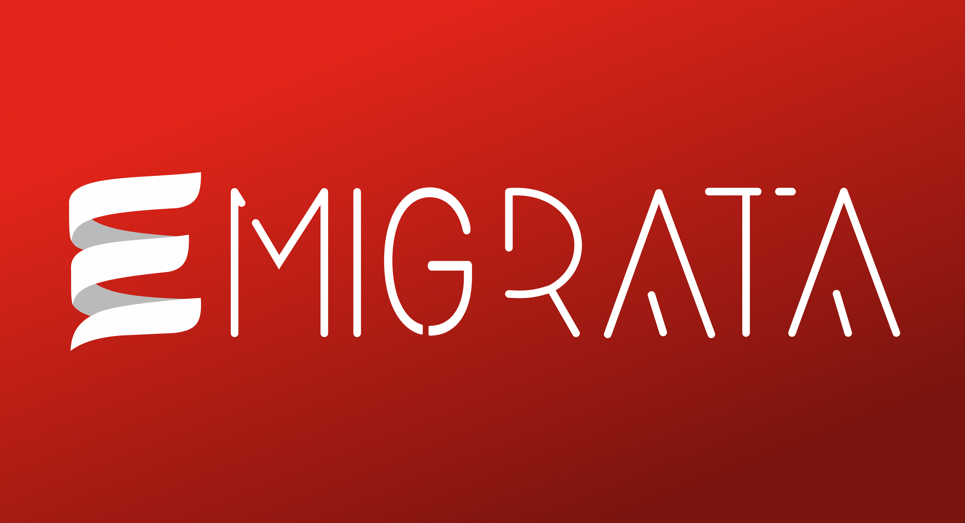
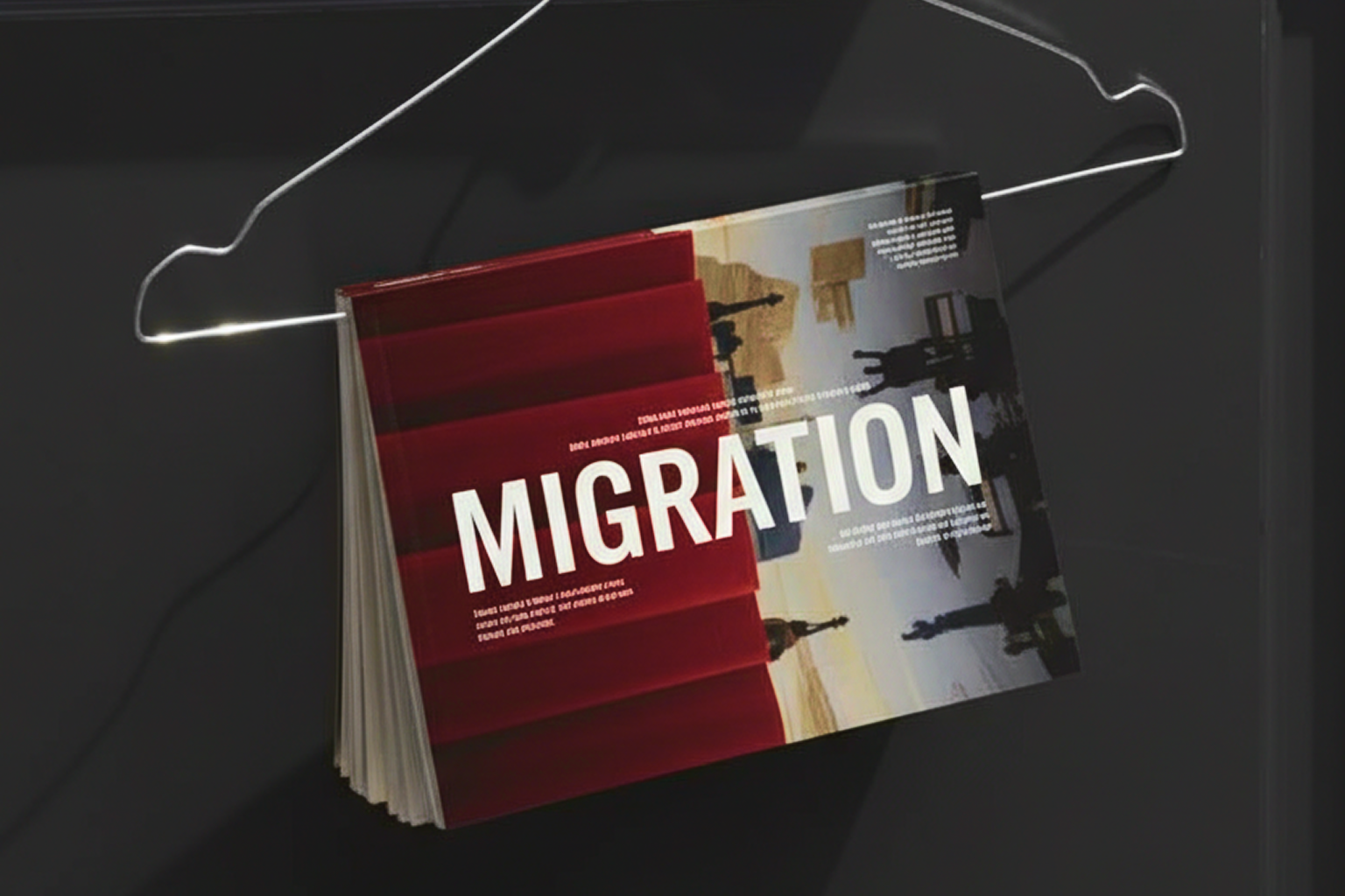
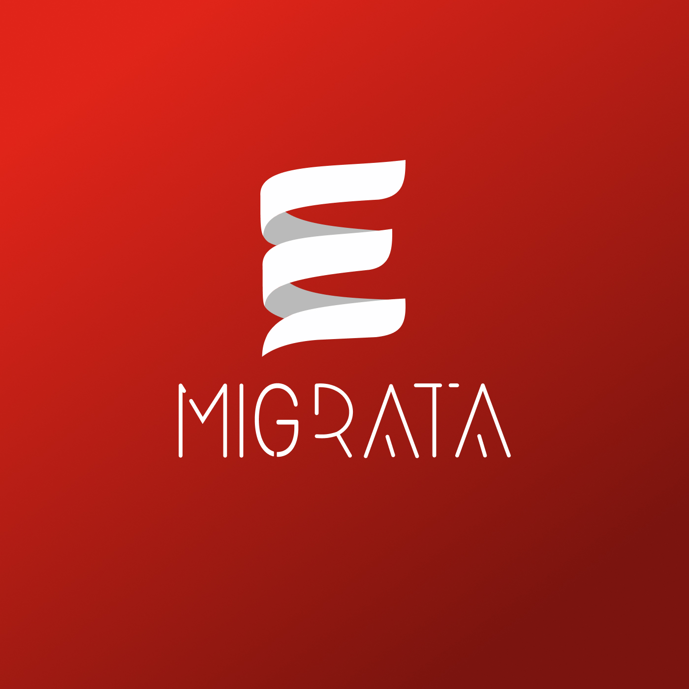
[Step 01]Logo Design
The logo was designed as a clean and modern wordmark with a distinctive symbol.
The flowing shape represents movement, transition, and continuity — core ideas behind migration and relocation. Its form subtly reflects direction and progress, symbolizing a guided path from one stage of life to another.
The custom letterforms emphasize openness and clarity, reinforcing trust and approachability while remaining professional and legally grounded.
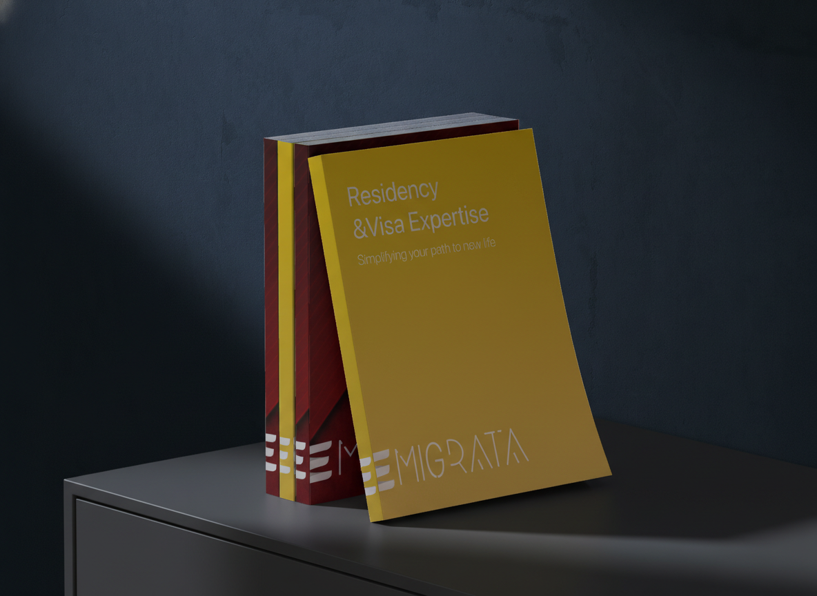
[Step 02]Brand Identity Development
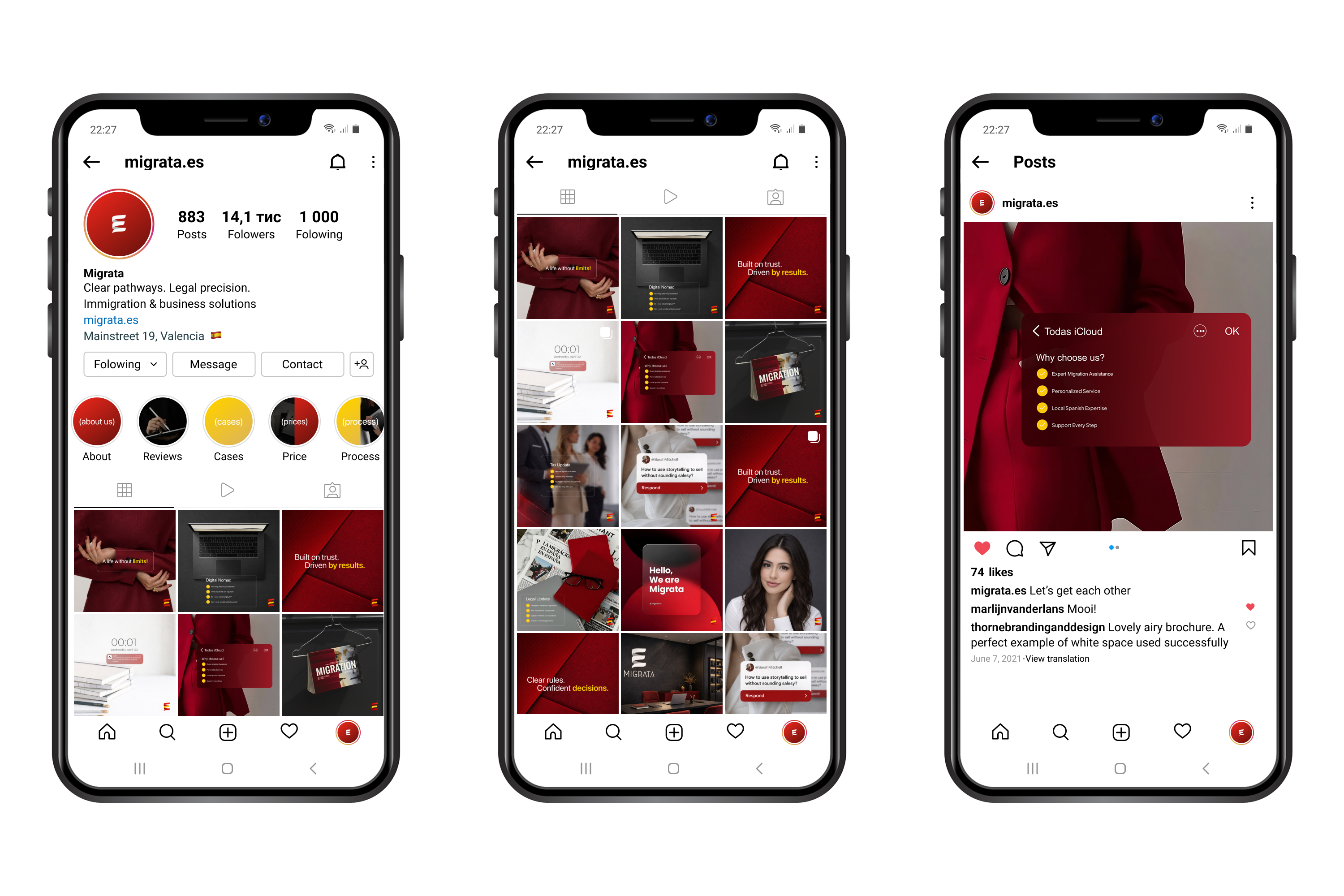
With the logo defined, we developed a cohesive brand identity system that works across all client touchpoints.
The identity was built to support:
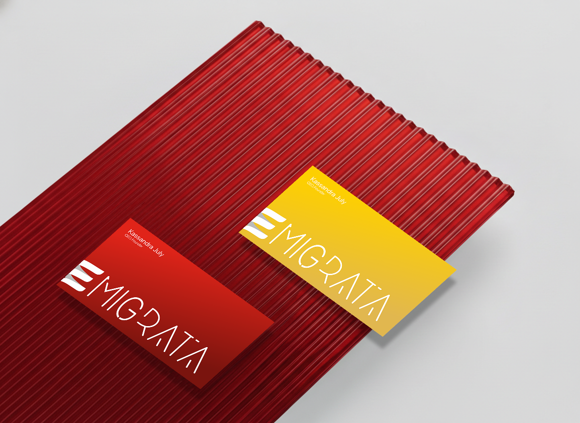
A. Legal documentationB. Digital platformsD. Social media
C. Physical materials
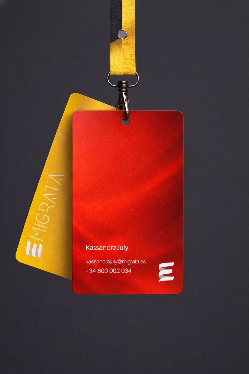
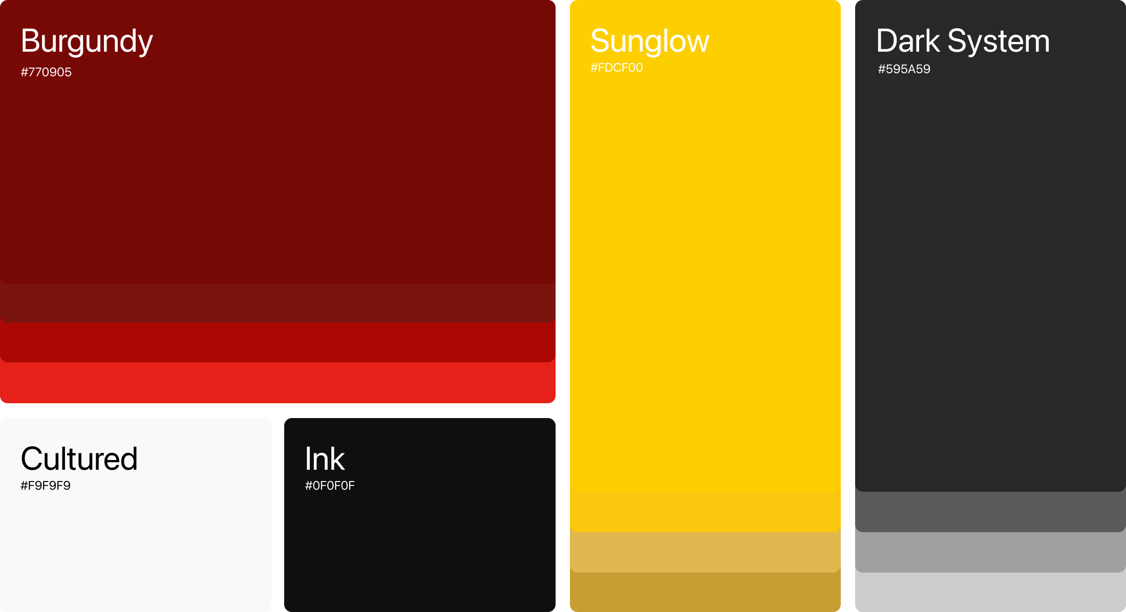
[A] / [B] Color & Typography
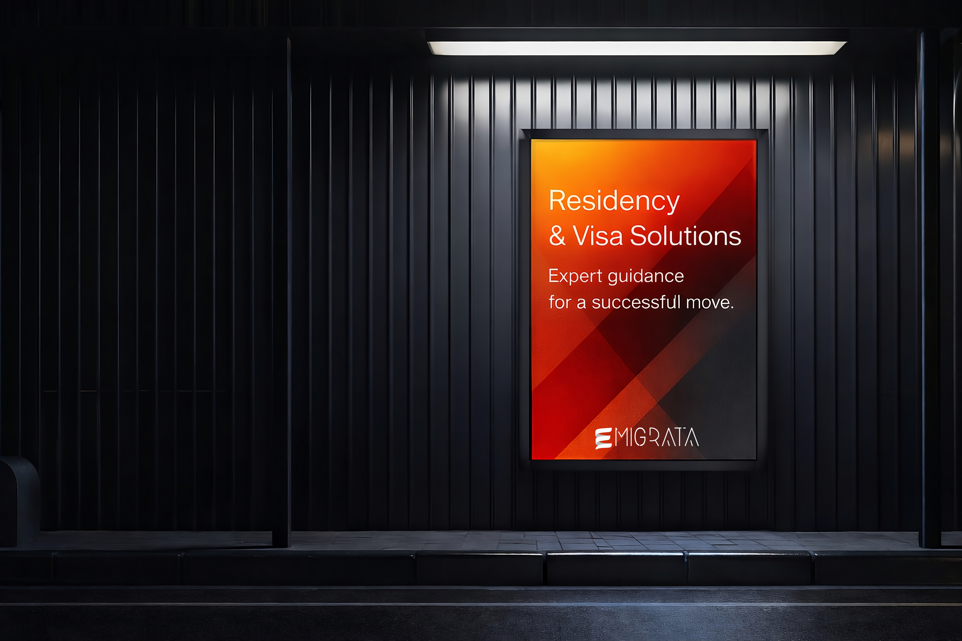
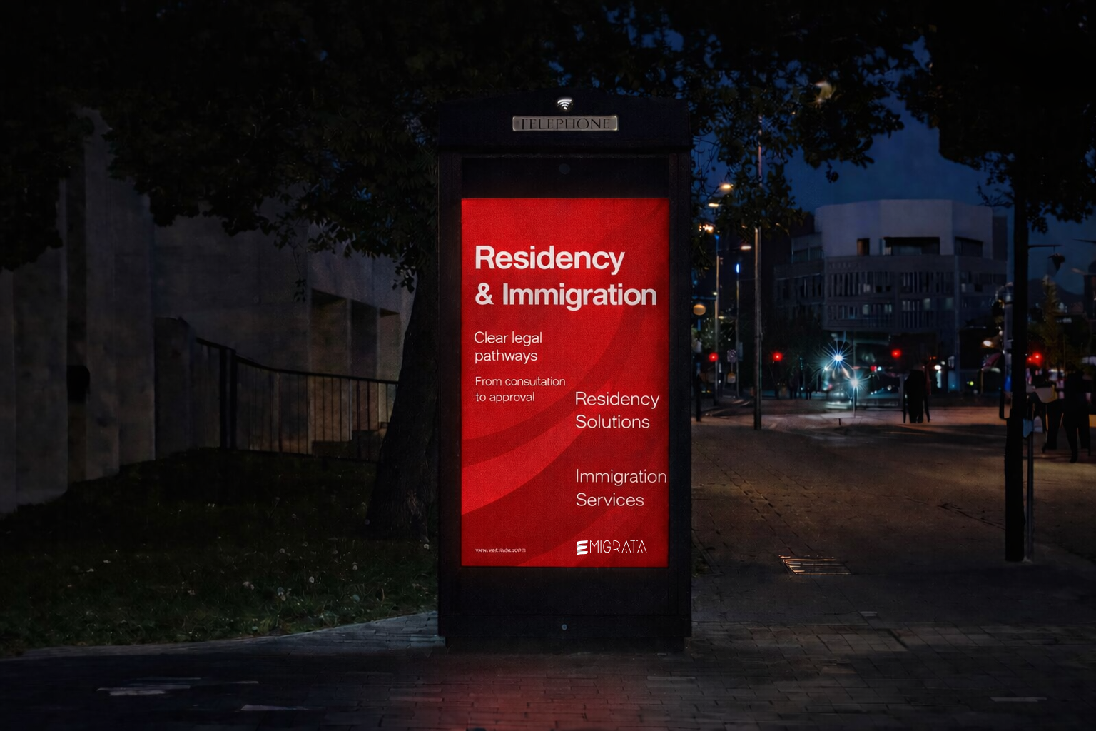
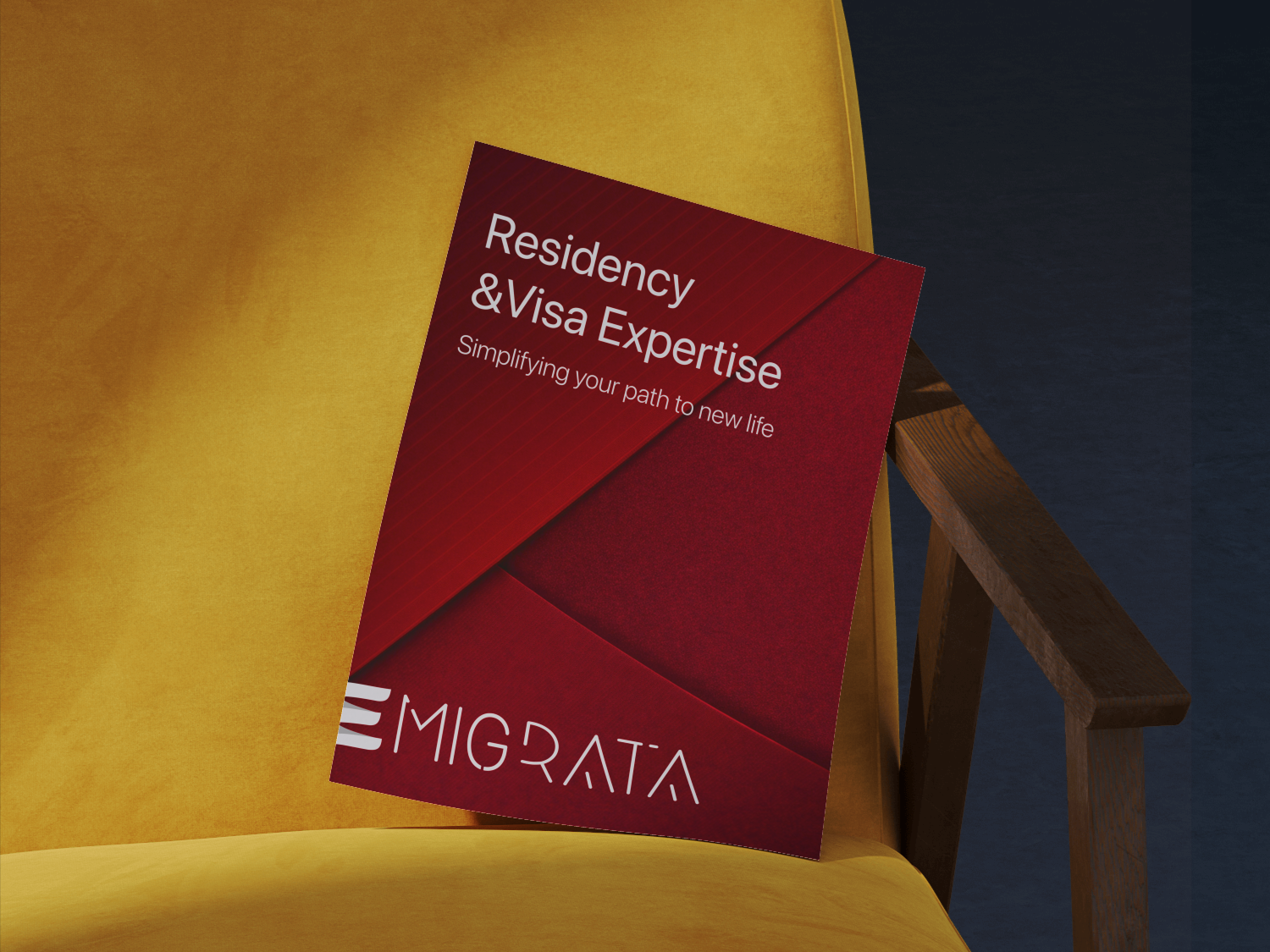
The color palette is based on deep reds and warm accents, conveying stability, confidence, and seriousness, while remaining modern and approachable.
Typography was selected for maximum readability and clarity, supporting both digital and printed formats. Clean lines and balanced spacing reinforce professionalism and make complex information easier to absorb.
Together, color and typography create a visual system that feels reliable, structured, and human — essential qualities for a migration agency.
Residency&Visa Expertise
SF Pro Regular Tracking: 0%
Migrata is a Spanish migration agency that helps people relocate, legalize their status, and build a stable future in Spain — with clarity, trust, and expert guidance at every step.Body CopySF Pro Regular Tracking: 0%
Spanish residency ad fast permitSF Pro Regular Tracking: 0%
Let's make your Brand shine
Migrata
Migration agency in Spain focused on clarity, trust, and long-term results.
CLIENT
Migrata
service
Branding
Country
Spain
Duration
3 days
Project goal
The challenge was to build a strong and credible brand identity for a migration agency working in Spain. The brand needed to convey trust, legal accuracy, and confidence from the very first interaction. At the same time, it was important to soften the complexity of migration processes and present them in a clear, calm, and approachable way for people making life-changing decisions.
Result
The result is a cohesive and confident brand identity that feels trustworthy and clear within the Spanish migration landscape. The visual language balances professionalism with warmth, helping clients feel supported and informed at every stage. The system brings structure to complex services, strengthens credibility, and creates a calm, reassuring experience across all brand touchpoints.
[Step 01]Logo Design
The logo was designed as a clean and modern wordmark with a distinctive symbol.
The flowing shape represents movement, transition, and continuity — core ideas behind migration and relocation. Its form subtly reflects direction and progress, symbolizing a guided path from one stage of life to another.
The custom letterforms emphasize openness and clarity, reinforcing trust and approachability while remaining professional and legally grounded.
[Step 02]Brand Identity Development
With the logo defined, we developed a cohesive brand identity system that works across all client touchpoints.
The identity was built to support:
A. Legal documentationB. Digital platformsD. Social media
C. Physical materials
[A] / [B] Color & Typography
The color palette is based on deep reds and warm accents, conveying stability, confidence, and seriousness, while remaining modern and approachable.
Typography was selected for maximum readability and clarity, supporting both digital and printed formats. Clean lines and balanced spacing reinforce professionalism and make complex information easier to absorb.
Together, color and typography create a visual system that feels reliable, structured, and human — essential qualities for a migration agency.
Residency&Visa Expertise
SF Pro Regular Tracking: 0%
Migrata is a Spanish migration agency that helps people relocate, legalize their status, and build a stable future in Spain — with clarity, trust, and expert guidance at every step.Body CopySF Pro Regular Tracking: 0%
Spanish residency ad fast permitSF Pro Regular Tracking: 0%
Let's make your Brand shine

leon akkerman
Migrata
Migration agency in Spain focused on clarity, trust, and long-term results.
CLIENT
Migrata
service
Branding
Country
Spain
Duration
3 days

Project goal
The challenge was to build a strong and credible brand identity for a migration agency working in Spain. The brand needed to convey trust, legal accuracy, and confidence from the very first interaction. At the same time, it was important to soften the complexity of migration processes and present them in a clear, calm, and approachable way for people making life-changing decisions.

Result
The result is a cohesive and confident brand identity that feels trustworthy and clear within the Spanish migration landscape. The visual language balances professionalism with warmth, helping clients feel supported and informed at every stage. The system brings structure to complex services, strengthens credibility, and creates a calm, reassuring experience across all brand touchpoints.
[Step 01]Logo Design
The logo was designed as a clean and modern wordmark with a distinctive symbol.
The flowing shape represents movement, transition, and continuity — core ideas behind migration and relocation. Its form subtly reflects direction and progress, symbolizing a guided path from one stage of life to another.
The custom letterforms emphasize openness and clarity, reinforcing trust and approachability while remaining professional and legally grounded.
[Step 02]Brand Identity Development
With the logo defined, we developed a cohesive brand identity system that works across all client touchpoints.
The identity was built to support:
A. Legal documentationB. Digital platformsD. Social media
C. Physical materials
[A] / [B] Color & Typography
The color palette is based on deep reds and warm accents, conveying stability, confidence, and seriousness, while remaining modern and approachable.
Typography was selected for maximum readability and clarity, supporting both digital and printed formats. Clean lines and balanced spacing reinforce professionalism and make complex information easier to absorb.
Together, color and typography create a visual system that feels reliable, structured, and human — essential qualities for a migration agency.
Residency&Visa Expertise
SF Pro Regular Tracking: 0%
Migrata is a Spanish migration agency that helps people relocate, legalize their status, and build a stable future in Spain — with clarity, trust, and expert guidance at every step.Body CopySF Pro Regular Tracking: 0%
Spanish residency ad fast permitSF Pro Regular Tracking: 0%
Let's make your Brand shine
leon akkerman