NOFF
NOFF is a studio that creates meaningful spaces guided by emotion, attention, and human connection. Based en Spain.

Project goal
The goal was to design a website for NOFF that reflects their philosophy through a calm visual language, subtle gradients, and a sense of intelligent comfort. The challenge was to combine aesthetics with clarity, creating an experience where users immediately understand that NOFF is about atmosphere, precision, and thoughtful technological integration.

Result
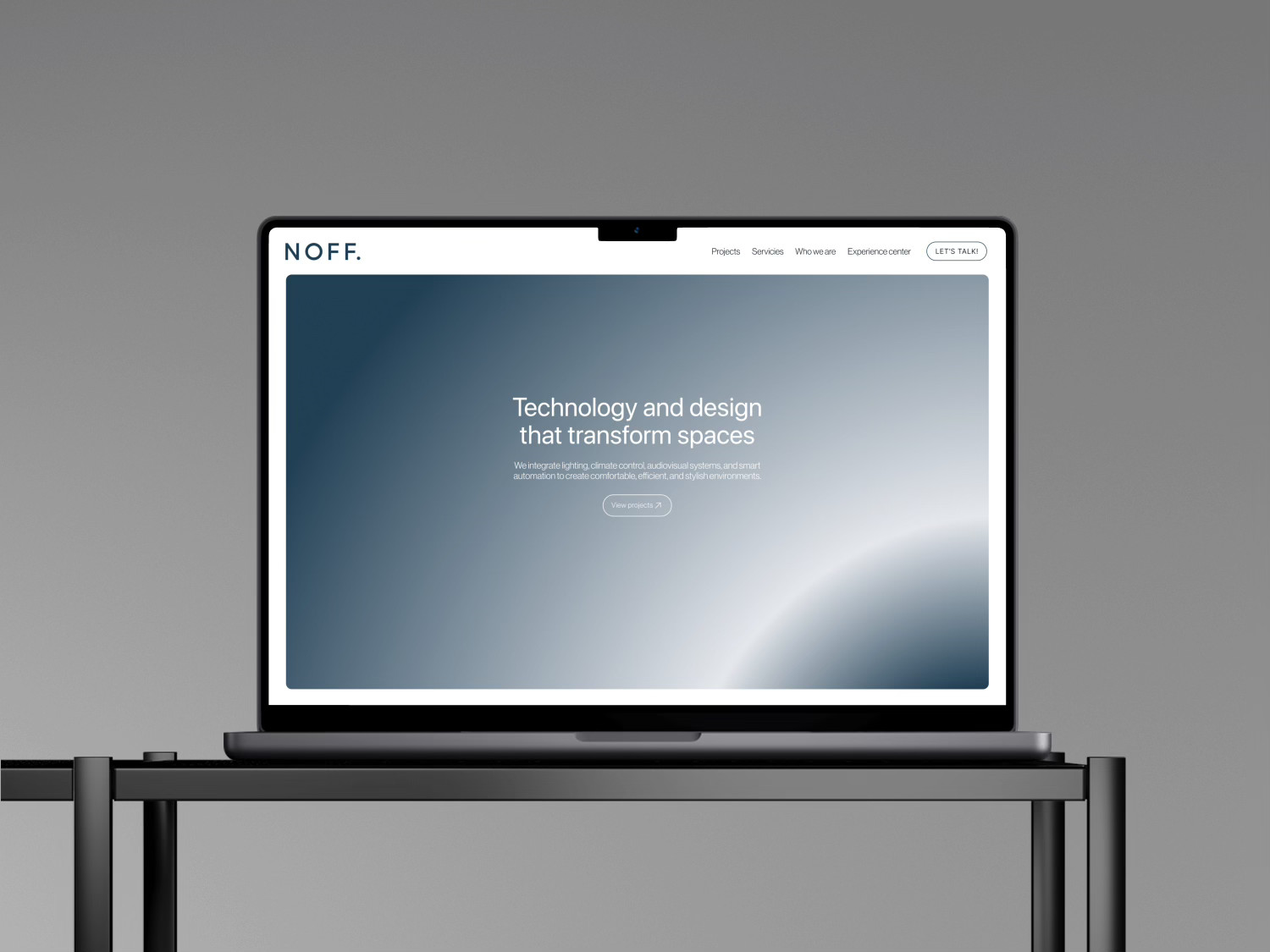
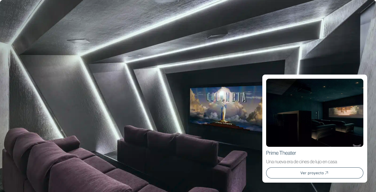
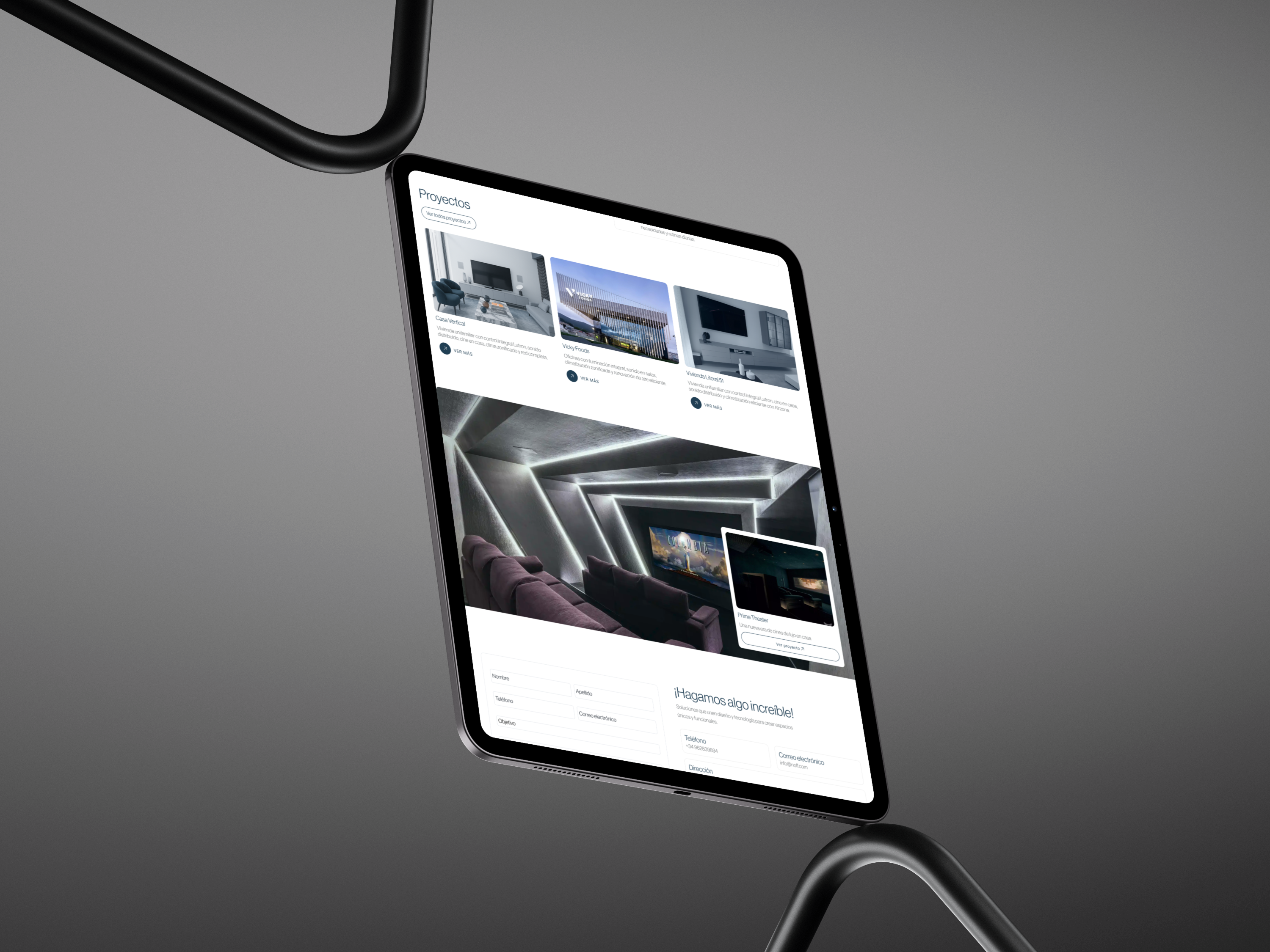
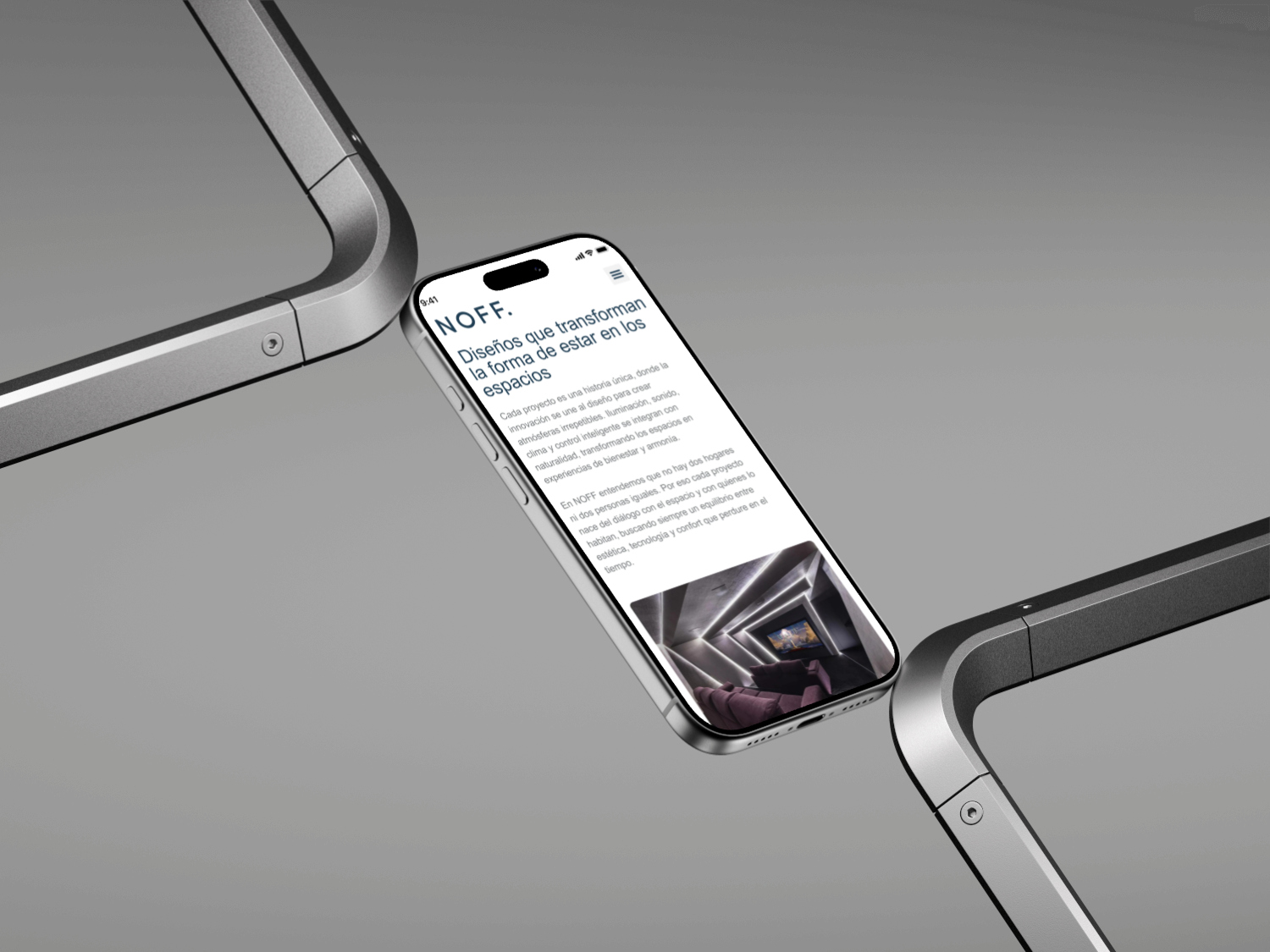
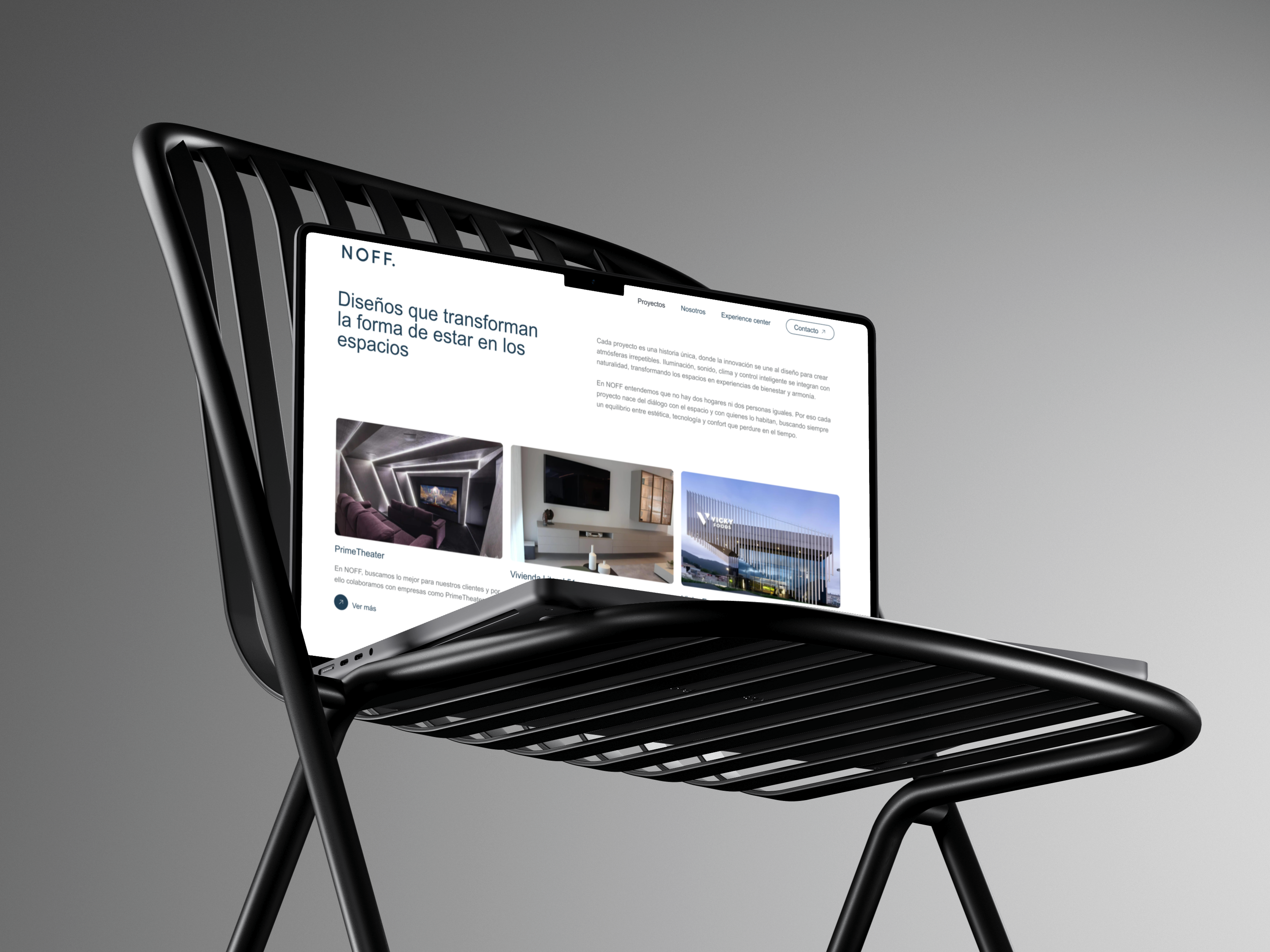
The result is a minimal, sensory interface built around clarity, balance, and visual softness. Each section unfolds the brand gradually — from emotion to function — while clean typography, smooth transitions, and carefully curated imagery create a sense of space. The final design strengthens NOFF’s identity and delivers a digital experience aligned with their approach to shaping meaningful environments.
[Step 01] Website Strategy & Content Structure
I started by defining the overall structure of the website and the role each section would play within the experience.At this stage, the focus was not on visuals, but on clarity — understanding how information should unfold as the user scrolls.
This step helped establish a clear narrative, define content priorities, and set the foundation for all further design decisions.
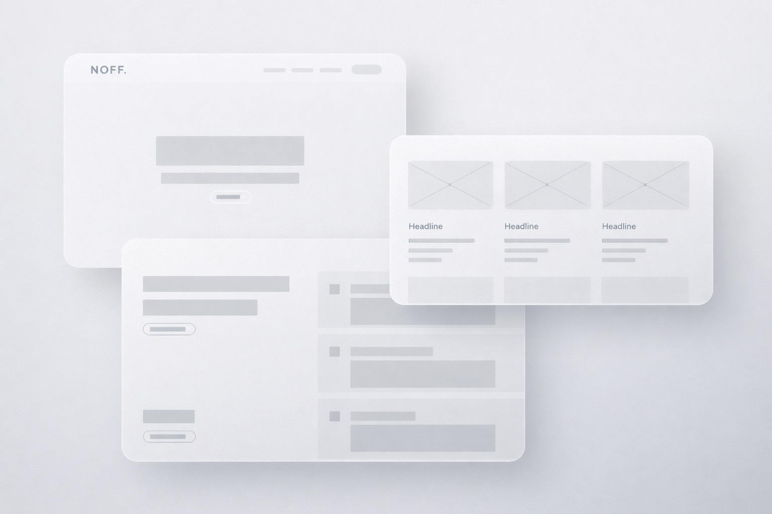
[Step 02] Wireframing & Layout Planning
With the structure in place, I translated the concept into wireframes to explore layout, proportions, and rhythm across the page.Working in low fidelity allowed me to focus entirely on hierarchy and flow, without the distraction of color or imagery.
The wireframes became a working tool to refine spacing, balance content density, and ensure the layout felt calm, structured, and intentional before moving into visual design.
[Step 03]Brand Application
Once the core structure was defined, I focused on applying the brand beyond the interface. The visual identity was translated into real-world touchpoints, ensuring consistency between the digital experience and the physical environment.
From spatial context to branded elements and presentation materials, every detail reinforces recognition and trust. The result is a cohesive brand presence that feels intentional, professional, and aligned across all platforms.

[A] / [B] Color & Typography
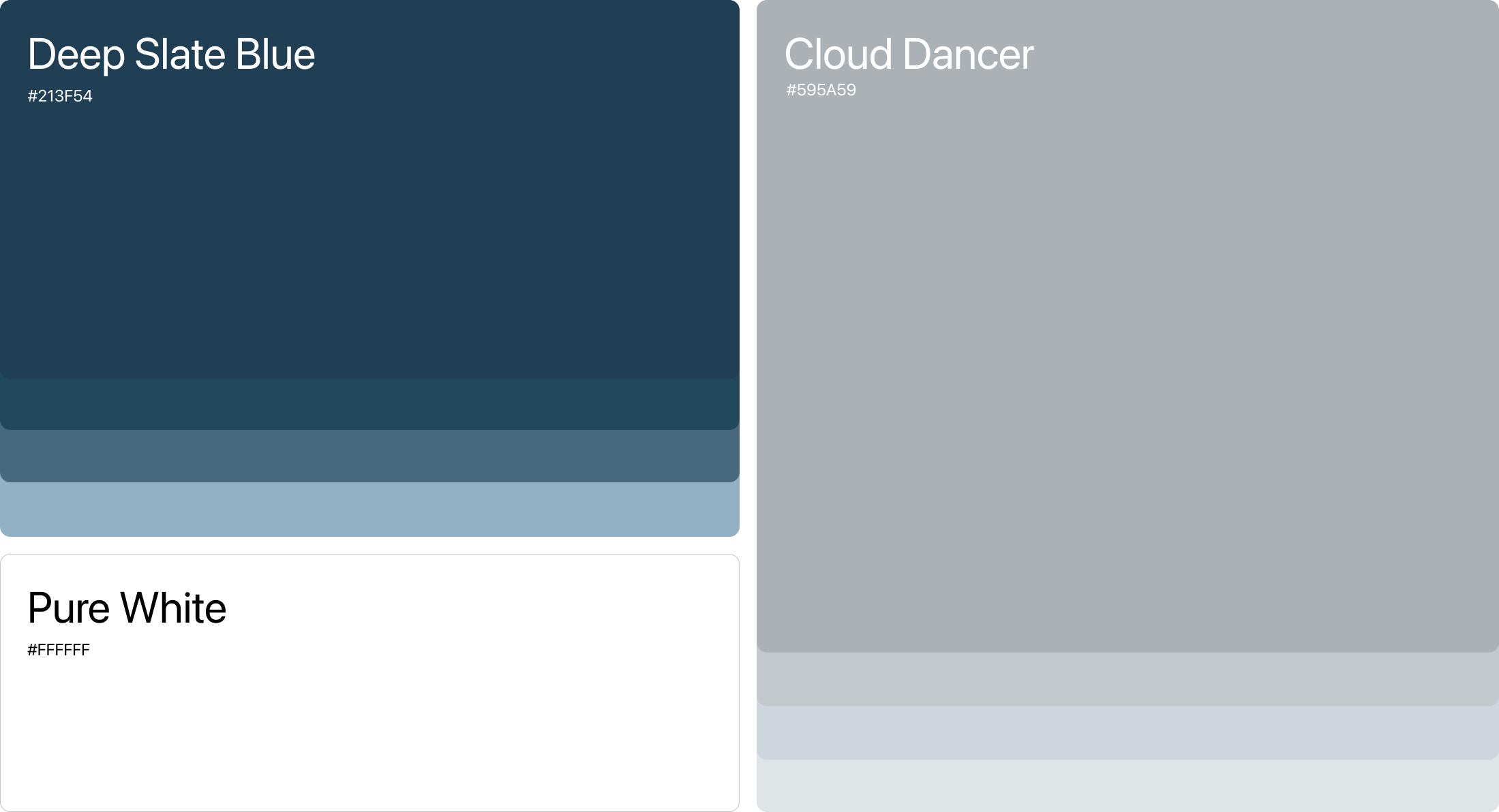
Color and typography were explored as functional components of the interface rather than decorative elements.They were chosen to reinforce hierarchy, improve readability, and maintain consistency across the site.
Together, they form a flexible visual system that supports both structure and expression within the digital experience.
Technology and design that transform spaces
Neue Haas Grotesk Display Pro 45Light
NOFF is a studio that creates meaningful spaces guided by emotion, attention, and human connection. Based en Spain.Body CopyNeue Haas Grotesk Display Pro 45Light
Depth of experience in advertising service that increases brand visibility.Neue Haas Grotesk Display Pro 45Light
Let's make your Brand shine
NOFF
NOFF is a studio that creates meaningful spaces guided by emotion, attention, and human connection. Based en Spain.

Project goal
The goal was to design a website for NOFF that reflects their philosophy through a calm visual language, subtle gradients, and a sense of intelligent comfort. The challenge was to combine aesthetics with clarity, creating an experience where users immediately understand that NOFF is about atmosphere, precision, and thoughtful technological integration.

Result
The result is a minimal, sensory interface built around clarity, balance, and visual softness. Each section unfolds the brand gradually — from emotion to function — while clean typography, smooth transitions, and carefully curated imagery create a sense of space. The final design strengthens NOFF’s identity and delivers a digital experience aligned with their approach to shaping meaningful environments.
[Step 01] Website Strategy & Content Structure
I started by defining the overall structure of the website and the role each section would play within the experience.At this stage, the focus was not on visuals, but on clarity — understanding how information should unfold as the user scrolls.
This step helped establish a clear narrative, define content priorities, and set the foundation for all further design decisions.
[Step 02] Wireframing & Layout Planning
With the structure in place, I translated the concept into wireframes to explore layout, proportions, and rhythm across the page.Working in low fidelity allowed me to focus entirely on hierarchy and flow, without the distraction of color or imagery.
The wireframes became a working tool to refine spacing, balance content density, and ensure the layout felt calm, structured, and intentional before moving into visual design.
[Step 03]Brand Application
Once the core structure was defined, I focused on applying the brand beyond the interface. The visual identity was translated into real-world touchpoints, ensuring consistency between the digital experience and the physical environment.
From spatial context to branded elements and presentation materials, every detail reinforces recognition and trust. The result is a cohesive brand presence that feels intentional, professional, and aligned across all platforms.
[A] / [B] Color & Typography
Color and typography were explored as functional components of the interface rather than decorative elements.They were chosen to reinforce hierarchy, improve readability, and maintain consistency across the site.
Together, they form a flexible visual system that supports both structure and expression within the digital experience.
Technology and design that transform spaces
Neue Haas Grotesk Display Pro 45Light
NOFF is a studio that creates meaningful spaces guided by emotion, attention, and human connection. Based en Spain.Body CopyNeue Haas Grotesk Display Pro 45Light
Depth of experience in advertising service that increases brand visibility.Neue Haas Grotesk Display Pro 45Light
Let's make your Brand shine

leon akkerman
NOFF
NOFF is a studio that creates meaningful spaces guided by emotion, attention, and human connection. Based en Spain.

Project goal
The goal was to design a website for NOFF that reflects their philosophy through a calm visual language, subtle gradients, and a sense of intelligent comfort. The challenge was to combine aesthetics with clarity, creating an experience where users immediately understand that NOFF is about atmosphere, precision, and thoughtful technological integration.

Result
The result is a minimal, sensory interface built around clarity, balance, and visual softness. Each section unfolds the brand gradually — from emotion to function — while clean typography, smooth transitions, and carefully curated imagery create a sense of space. The final design strengthens NOFF’s identity and delivers a digital experience aligned with their approach to shaping meaningful environments.
[Step 01] Website Strategy & Content Structure
I started by defining the overall structure of the website and the role each section would play within the experience.At this stage, the focus was not on visuals, but on clarity — understanding how information should unfold as the user scrolls.
This step helped establish a clear narrative, define content priorities, and set the foundation for all further design decisions.
[Step 02] Wireframing & Layout Planning
With the structure in place, I translated the concept into wireframes to explore layout, proportions, and rhythm across the page.Working in low fidelity allowed me to focus entirely on hierarchy and flow, without the distraction of color or imagery.
The wireframes became a working tool to refine spacing, balance content density, and ensure the layout felt calm, structured, and intentional before moving into visual design.
[Step 03]Brand Application
Once the core structure was defined, I focused on applying the brand beyond the interface. The visual identity was translated into real-world touchpoints, ensuring consistency between the digital experience and the physical environment.
From spatial context to branded elements and presentation materials, every detail reinforces recognition and trust. The result is a cohesive brand presence that feels intentional, professional, and aligned across all platforms.
[A] / [B] Color & Typography
Color and typography were explored as functional components of the interface rather than decorative elements.They were chosen to reinforce hierarchy, improve readability, and maintain consistency across the site.
Together, they form a flexible visual system that supports both structure and expression within the digital experience.
Technology and design that transform spaces
Neue Haas Grotesk Display Pro 45Light
NOFF is a studio that creates meaningful spaces guided by emotion, attention, and human connection. Based en Spain.Body CopyNeue Haas Grotesk Display Pro 45Light
Depth of experience in advertising service that increases brand visibility.Neue Haas Grotesk Display Pro 45Light
Let's make your Brand shine
leon akkerman